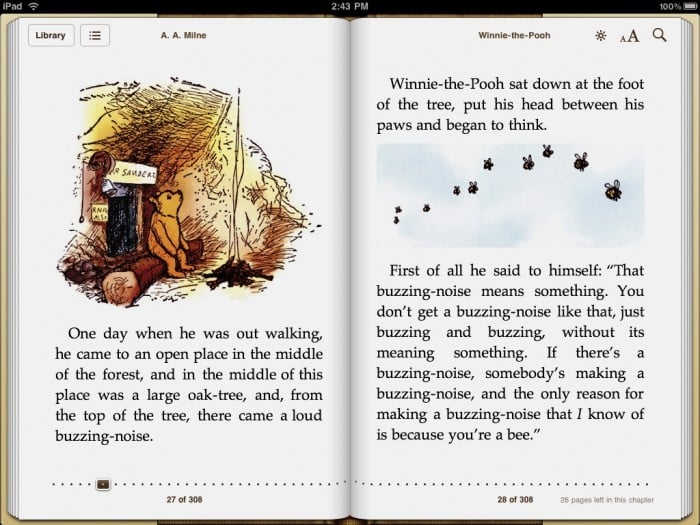
Winnie the Pooh iBook on the iPad–not bad, but could be soooo much better
With the explosive growth of the eBook market, one would think that the design of eBook reader apps would, by now, be well-advanced. Lots of cool options, good readability, and all kinds of thought put into their design.
One would be wrong.
Initial background info: I have been writing information to be distributed online for nearly 20 years now–since 1992, to be exact. This is my life, my work, my calling–it is more than an avocation. I think about the best way to deliver information online all the time. I’ve initiated polls. I’ve read research. I’ve talked to dozens of experts in the field, and tested dozens of different systems, from closed ones like iBooks to online open things like Wikipedia. I am not trying to impress anyone by relaying this information; I just want you all to know that I think about this stuff a lot. And not only that, but I do it as a job. Yes, my area is technical writing, i.e. putting out information on networking protocols or describing how to use software tools or how to put together and physically care for giant behemoth routers, which is a bit different from producing eBooks, but you can see the similarity, I hope. This is what I do.
I just mention all that in the hopes you will keep it in mind during this semi-rant. And I apologize for its length.
See, what’s really starting to get my goat is the continuing lameness in eBook readers. eBook readers have been around for a while now. I’ve been reading eBooks since I had my old Tapwave Zodiac, and that was 3 iPhones and an HTC Universal ago, so it’s been quite a while. Point being, they’ve had plenty of time to get their merde together, and they haven’t, really.
(I’m not even talking about enhancements and bells and whistles here, like The Elements or Solar System or the great work the folks at Inkling are doing; I’m talking about basic, raw, words-on-screen reading. You sitting down with the latest Steven King or autobiography of Teddy Roosevelt or (finally!) the complete set of Harry Potter. And frankly, the software folks are blowing it.)
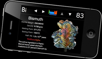 The Elements–an app that’s more than “just a book”
What makes a good eBook reader, and what are these apps missing? Well, I’m glad you asked!
The primary job of an eBook reader is a comfortable reading experience. Some things that help:
- Ability to adjust the screen brightness from inside the app
- Ability to choose fonts and sizes that are comfortable for you
- Ability to choose background and foreground colors–a set of various themes is good; the ability to create and save your own theme is even better
- Ability to select margins and justification (And for those of you who are wondering, “justification” just means whether the words align with the margins, and in what manner. Newspapers, for example, tend to be “fully justified”, meaning that the print is set in such a way so that the text aligns with the margins on both sides. This is why in newspapers you sometimes see a single word,w i d e l y s p a c e d–both margins have to align.)
- An indication of where you are in the book, and the ability to navigate elsewhere
Why do these help? Too bright a screen–if you read in bed, say–can cause eye-strain. Some combinations of background and foreground colors are easier on the eye–I prefer my letters be navy, or at least slightly lighter than dead black, and the background to be more of a parchment color. Research has shown that ragged-right justification–that is, when the left margin is constant, but the right margin varies depending on the words on each line–is easier to read. Similarly, research has shown that for most people, serif fonts–those are the ones that have little thingies sticking off the letters (this is serif; this is sans-serif)–are easier to read.
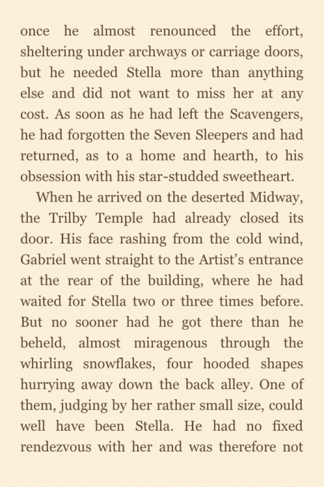
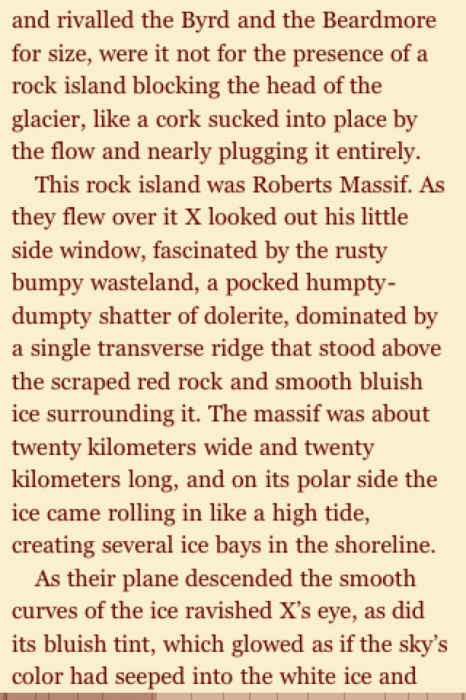
Fully justified text on the left; ragged-right on the right
But since all this varies from person to person, it’s good to both have a default that takes into account the research–have the default be a nice, serif font, with ragged-right justification, a nice combination of background and foreground coloring, and so on–in combination with the capability of adjusting things if you have different preferences. How many of the current eReader apps include all these? None, that’s how many. Kindle is closest right now, but still does not allow you to choose justification. The problem with full justification on a small screen like an iPhone or a Droid is that it increases eyestrain.
In a similar vein is navigation, which is a fancy word we online writing types use to describe things like bookmarks, tables of contents, and things of that nature. You want to be able to access the Table of Contents from pretty much anywhere, and also be able to quickly find your bookmarks. And again, this simple thing is not done very well in, for example, the Kindle app. You open the navigation, and you have to tab on a link to get you to the table of contents page, instead of just popping up the table of contents. Honestly, that’s just plain silly.
This isn’t that hard to fix, software dudes; fix it! (The extra-frustrating thing is, the final, pre-nook revision of the Barnes and Noble eReader app–the one they bought from Fictionwise–got all this stuff right! The example is out there, people! Follow it!)
The other big feature of eBooks–and the thing that makes eBooks actually superior to paper books–is the ability to search. And none of the apps get it right, and it drives me insane. The Web is now going on 20 years old; online searching should be old hat by now. Open a PDF file–what are the options that Adobe gives you for searching that PDF? You can type in a quick search term, yes, but you can also define capitalization, whether or not you are searching for a full word or portion of the word, and so on. In a book, another good option to have is, do you want me to search from the current location, or from the first page? How about confining a search to the current chapter? If the book has a glossary, how about confining it to the glossary? Or the index? The ability to look up a term in a dictionary, or in Wikipedia (or Wikipanion, if you have it installed), or via a web search in Google?
(A subset of this is the ability to find your book in your library. Once again, none of the readers get it quite right, while the old Fictionwise eReader did. You put in an alphabetical tab down one side of the list of books. How hard is that to do, eBook app designers? C’mon! [And the fact that Apple is still not doing this is almost unbelievable–they have it in seemingly every other list-based app they produce; why not iBooks? Yeesh.])
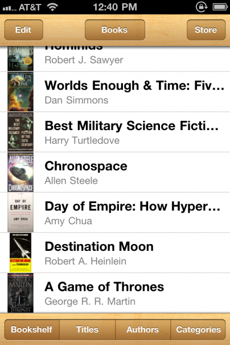
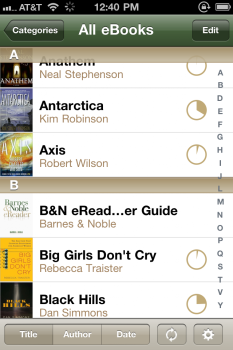
iBooks “Bookshelf” page on the left; old Barnes and Noble/Fictionwise version on the right; which do you think is easier to find books in?
But noooOOOooo; none of the current apps have those features. And while some have some features, the implementation is, well, lame. In Kindle, you can do an in-app Wikipedia search on a term, but only a single word, not multiple words. In iBooks, if you want to search on a term, you have to go to the search window, which then pops you out of the app entirely. Neither allows you to search based on capitalization, or your current location in the book. It’s simply astonishing that this incredibly basic piece of functionality is so poorly implemented.
I hate to belabor this, but again, the pre-Nook Fictionwise eReader app had a lot of this right. Not that it got everything right, but it was really, really close. I would be buying only from B&N right now, had they simply kept that app and continued to improve it. But now? I go back and forth between Kindle and iBooks, and I’m not real happy with either.
Finally, there are the bells and whistles–and in this area (naturally) the eBook apps actually excel. Things like inserting and finding bookmarks, doing notes, highlighting text, and so on. Both Kindle and iBooks have very nice-looking highlighting apps; inserting bookmarks in the Kindle app is very simple (and stupidly multi-step in the iBooks app), making notes, finding your notes and comments–all are handled just fine by all the apps. The problem is, these are the last things I want the software boffins to be concentrating on. I would rather have ragged-right and the ability to set themes than Apple’s cool page-turning feature. That stuff just isn’t as important. Alas, it seems like it’s the stuff the software folks are focusing most on, rather than least.
So it’s frustrating for eBook app users these days, folks. Those are my thoughts. (Can you tell I spend way too much time thinking about it?) Share yours below.

