[Note: This is a joint article being written by Doug, Lauren, and Sue. Doug’s comments will appear in normal typeface, Lauren’s in bold, and Sue’s will be italicized. We are also simultaneously posting it on both JAMM and Gear Diary.]
Doug: I had a nice surprise in the mail the other day when I tore open a Fed Ex envelope to find the HTC Touch Pro. By coincidence, as you may have noticed, Lauren and Sue (for you Gear Diary readers, they are both contributors at JAMM) both also picked up the HTC Touch Pro earlier this month. So, we thought it would be fun for all of us to share our thoughts together on this new device. The Touch Pro is the latest offering from HTC and the successor to my previous phone, the Sprint Mogul. We’ll take a closer look at all of the features of the phone, including the new Touch Flo 3D interface. Today, though, we just wanted to take a quick look at what is in the box and share a few preliminary thoughts.
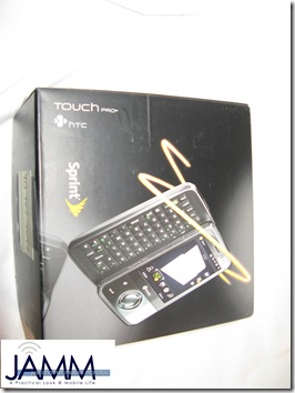
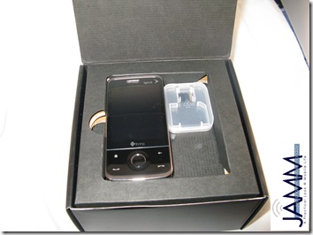
OK. So, let’s get started. The packaging is nothing fancy. Pretty standard Sprint fare really. Open the lid and there she is, the Touch Pro, right on top where you can admire the phone before you get distracted by everything else in the box.
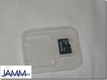
But that is not all we see here. Right next to the phone is a 1GB microSD card. I was pretty impressed that this phone came with a full 1GB card. While it is not unusual for phones with a memory card slot to come with a small card, I was pretty impressed by the size of this one. Then again, considering the amount of space required for videos or music, maybe 1GB is not such a lot of space. But it is considerably more than a lot of phones include, and a nice size to get you started.
Lauren: I think the 1GB card is partly like the chocolates nice hotels leave on your pillow: it’s a signal that this is a premium product. It works; I was impressed way beyond the actual cost of the card.
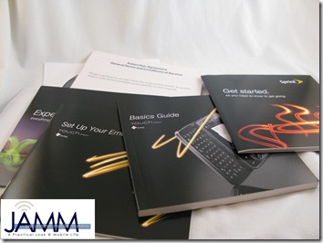
Doug: Next, we will go ahead and pull out that cardboard shelf from the box. In the bottom of the box you will find a nice little package containing all of the manuals, quick start guides, software, and other paperwork.
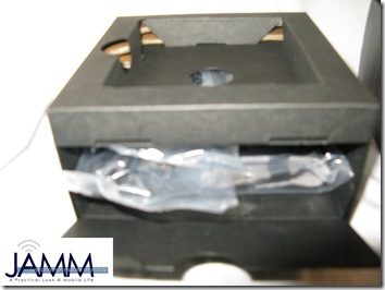
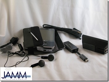
I will admit to a little confusion at this point. Where were all of the cables? Then, I realized the cardboard shelf felt heavier than it should have. After a quick inspection, I found a panel on the side of the shelf, which opened to reveal another compartment containing the Touch Pro cables and included accessories. Here, we have:
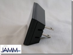
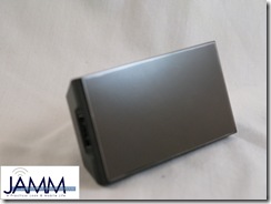
Doug: A USB sync/charge cable, along with one of the oddest shaped AC adapters I have ever seen. Still, in this age of ignoring the AC adapter entirely, I was just happy to have one included.
Lauren: Come on, Doug, it isn’t that funny-shaped. I like it — it’s very compact. Many phones require you to have separate cables for syncing, wall charging, car charging, and so on, so I appreciate the fact that this one is a true adapter with a slot for the sync cable’s USB connector.
Doug: It is a nice addition. But still funny shaped.
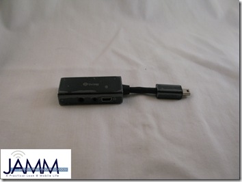
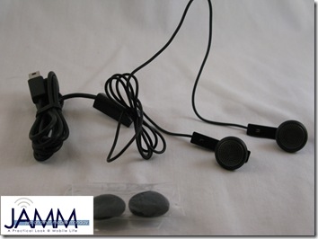
Doug: One of my least favorite accessories is the 4-in-1 headset adapter. Since HTC continues to insist upon not including a headphone jack on the phone, they must add this adapter which includes a mini USB connection, 2.5 mm headset jack, and 3.5 mm headphone jack. There is also a second mini USB connection so you can plug it in while you listen. Why HTC continues to refuse to include a headphone jack on the phone itself, and eliminate this bulky adapter is beyond me.
Lauren: Does the Touch Pro support stereo Bluetooth profiles? That would make it marginally more forgiveable.
Doug: That is a good question and something we will have to explore as we get more into this device. The Mogul claimed to handle stereo Bluetooth, but had some real problems in that department.
Sue: It has been noted on other forums that some people have been attempting to insert headphones into the soft reset button next to the mini USB connector, causing the device to restart.
Doug: And that would explain the extensive manuals which were buried in that box.
Doug: Along with the adapter, there is also a pair of iPod-style, out-of-the-ear bud style headphones, with a microphone for phone calls. It is unlikely these will ever see the light of day again.
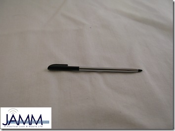
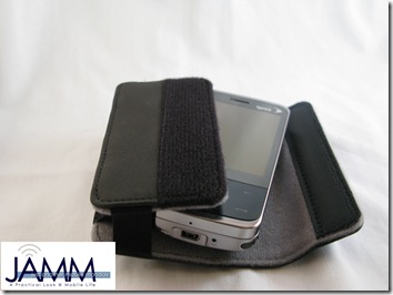
Doug: There is also an extra stylus, which I really liked because I have a propensity for losing styli (Sue: the stylus is magnetic); and a pouch style case.
Lauren: It’s ironic that we finally see a phone with nice anti-stylus-loss features, and the interface is almost entirely touch-based.
Doug: Interestingly, I found myself reaching for the stylus more than I expected. I think because it was so convenient. And while we are on the subject, I was glad to find that HTC has banished the collapsible stylus design which they featured in the Mogul.
Doug: Now, let’s talk about the case.
Lauren: Please, let’s talk about the case.
Doug: When we originally reviewed the Mogul, I thought the case was passable. It got the job done and provided adequate protection. Judie, on the other hand, never took a second look at the case, and almost immediately discarded it. Well, I think Judie and I would agree that the Touch Pro case is a significant downgrade from the case included with the Mogul. Most notably, they have inexplicably replaced the sleek magnet closure with a strip of Velcro. Not very subtle at all. And I have absolutely no good explanation for why HTC made this change.
Lauren: What completely puzzles me is the high quality of the rest of the accessories compared to the disappointing case. The Velcro closure is bulky, and it makes taking the phone out a slow and noisy job. Everything else in the box is so sleek that the case sticks out like a sore thumb.
Doug: Exactly. I have no explanation for the terrible decision which led to this case. I wish they had simply stuck with the one they included with the Mogul.
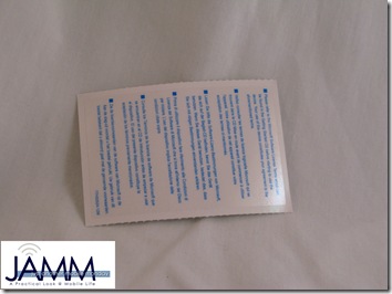
Lauren: There is one last accessory in the box, which is a screen protector. Although it’s not the best I’ve tried, I am glad this was included since I am using it until I find a case that fits my needs better.
Sue: The screen protector was awful!
Lauren: I was trying to be diplomatic.
Doug: Folks, in case you have not realized it yet, Sue is our resident expert on screen protectors. Frankly, if she says it is garbage, then I would listen to her and make this one of your first upgrades.
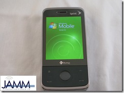
Doug: This brings us to the Touch Pro itself (can you believe we made it this far without talking about the device itself?) The first thing I noticed was the vibrant screen. Although it is listed as being the same size as the Mogul screen, the significantly increased resolution (HTC is finally offering a VGA screen) makes an enormous difference.
Lauren: Doug, that size comparison really surprises me. If you had asked me to guess, without directly comparing them, if the Mogul or Touch Pro had a bigger screen, I would have told you the Touch Pro’s is much bigger. The sharp VGA resolution definitely improves the visibility, and the flush design creates an optical illusion so the screen seems even larger.
Doug: I agree. I was surprised too, and I think you hit the nail on the head with the reasons for this illusion. The flush screen really makes it feel much larger. According to the spec sheets, both are 2.8 inches (diagonal) and my measurements supported them being roughly the same, even though the Touch Pro appears to be longer and skinnier. Go figure.
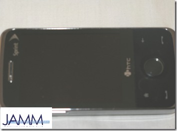
Lauren: However, I was impressed before I ever turned anything on. The Touch Pro is one classy-looking device. Sprint lists the color as black, but the phone is more of a gunmetal gray and very elegant. The first thing I noticed was how beautifully streamlined the overall design was.
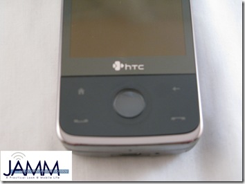
Doug: Beneath the screen are four buttons: start call, end call, home, and back. Between these buttons is a unique D-pad control. There are two important features here. First, the entire face of the phone is completely flat. The screen, the buttons, top to bottom is one smooth surface, which really makes for a cool effect. Second is the lack of blinking lights. On the Mogul, a green light blinks at all times. A blue light blinks for Bluetooth, and practically the whole thing lights up like a Christmas tree when you take any action. Not so with the Touch Pro. That blinking green light is (thankfully) gone. In fact, the only light here is a white backlight on the buttons, which blends perfectly into the rest of the interface.
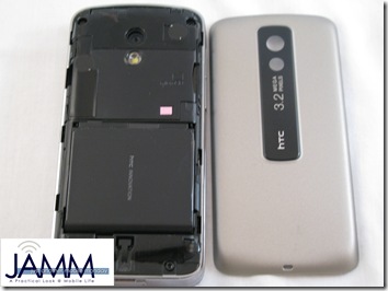
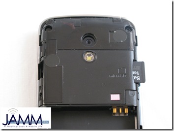
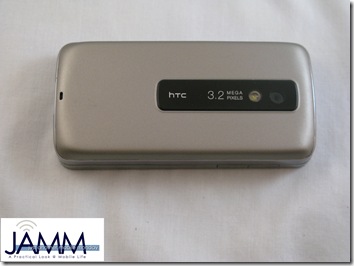
Doug: Contrary to the rumors of the Diamond, the back of the device is smooth. You will need to slide the back up in order to access the battery (I will admit that Lauren had to help me figure that one out).
Lauren: And I had to get help first.
Sue: I work with these things all day, so I guess it was a no brainer for me.
Doug: This is why we keep Sue around, so she can help us all figure out how to change a battery.
Beneath that panel is the battery, which is slightly larger than originally rumored. We’ll give it a more thorough test later.
Doug: Here, you will also find the microSD slot. I was a little frustrated that you will need to remove the back of the device in order to swap cards. That does make it difficult to swap cards on the go.
Doug: You will also notice the 3.2 megapixel camera. This is an improvement from the 2.0 megapixel camera on the Mogul, and I will be interested to see how it fares.
Finally, I noticed the almost complete lack of buttons on the rest of the device. The Mogul had close to a dozen buttons, connections, wheels, and other controls around the edges of the device. The Touch Pro has:
- A sleep/power button on top
- Volume controls on one side
- A mini USB connection and soft reset button on the bottom
- The stylus
and that’s it. I will admit that I already miss the scroll wheel, which I was thrilled to find on the Mogul; and the OK button, which saved me from thumbnailing the “X” button on top of the screen. Still, I was very happy to find how much this device relied upon the touch screen instead of hardware controls.
Lauren: In a way, the Touch Pro does have a scroll wheel. The central button is touch-sensitive, which we’ll go into more when we talk about the hardware. However, we can’t finish this article without at least mentioning the large horizontal slide-out keyboard, which is a big reason why I chose the Touch Pro over the Diamond.
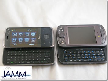
Doug: Good point. I was hesitant to go for another sliding keyboard after the Mogul (which is on the right, above), but this is a huge step up from that one. This is a full five-row keyboard, with all of the keys exactly where you would expect them in a standard QWERTY layout. I also have not experienced any of the keyboard lag, for which the Mogul was notorious.
I cannot wait to get to know this device even better. In the coming weeks, we will be diving headfirst into the Touch Pro, looking at all of the controls, features, and hardware. We will also take a much closer look at the TouchFLO 3D interface and some of the other included software. So, stay tuned. We have plenty more to come.
