[Note: This is a three-way, multi-site review. Chris Spera (italics), Clinton Fitch (bold), and Doug Goldring (plain text)have all teamed up to review Mobile Shell 3 together. It is being simultaneously posted on Gear Diary, and Just Another Mobile Monday.]
It is hard to believe that it has been only a little over two years (February 2007) since Spb Software House revolutionized the way we use our Windows Mobile devices. Since that time, dozens of other software developers and OEMs such as HTC, Samsung, and Sony-Ericsson have adopted this same technique of replacing the user interface entirely. Through all of this, however, Spb Software House has managed to stay one step ahead of all the others by constantly refining and updating Mobile Shell. And just when it looked like some of the other shell-type programs might be gaining a foothold, Spb ups the ante again with version 3 of their award winning program. You are really going to want to sit down, hit the jump, and enjoy the ride for this one.
Doug: With every iteration of Mobile Shell, Spb has meticulously offered new ways to access your important information. With version 1, they started with the Now Screen and Menu, which replaced the Start Menu. Version 2 dug more deeply into your device, with the Contacts Screen and Launcher. Now, with version 3, Spb is pulling out all of the stops, giving us the carousel view, which lets you scroll through and access any screen in the interface; and the limitless customization of the lifestyle view. But we are getting a bit ahead of ourselves. Let’s get back to the beginning.
Chris: I have to agree with you, Doug. Spb certainly started something here; and you’re definitely right about a number of other players throwing their hats into the ring. HTC has really tried hard with both HTC Home and TouchFlow 3D. They have clearly targeted Spb’s Mobile Shell with their latest versions of TF3D, and Spb has clearly…CLEARLY taken up the challenge and fired back with Mobile Shell 3; but like you, I’m jumping the gun…
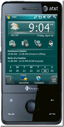
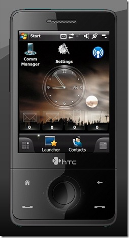
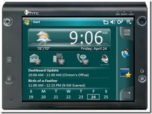
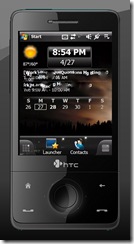
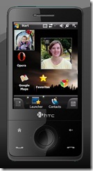
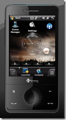
Doug: Like Mobile Shell 2 (above, left), the main view in Mobile Shell 3 (above, right)still consists of three screens: Now, Launcher, and Contacts. But each of these three screens has been significantly updated with all new controls and graphics.
Clinton I fully admit that when the first version of Mobile Shell came out I simply didn’t get it. Part of it was me. Having had used Windows Mobile since the way early days, I’d become so use to the Today screen and plug-ins that the whole concept was a challenge for me to understand. By the time 2.0 came around I was hooked. It so revolutionized the way I used my phone! Now with 3.0, I’ve completely ditched the Today screen as it comes out-of-the-box and on my HTC Fuze, I’ve even ditched TouchFLO 3D, something I did not think I’d do for anything.
Professional Now Screen
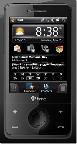 Doug: The Professional Now Screen should look familiar to anyone who has used Mobile Shell in the past. On the surface, it has not changed much (Although I do lament the removal of the Classic View,) but it does feel much slicker and more in control than the previous version.
Clinton: I love the new layout of the Professional screen. I find it decidedly better than in 2.0 as it looks more, well, professional. I never was a big fan of the Classic View so not much missing there for me, Mr. Doug.
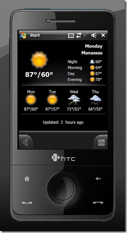
Doug: On the top of the Professional Now Screen, you will find the weather and clock. Tap on the weather icon to head into the weather sub-panel. Sadly, this will give you only a four day forecast, as well as a little more detailed breakdown of the weather of the course of a selected date. I did remain disappointed, however, with the continued inaccuracy of the weather forecasts coming out of Spb. While they are starting to improve, you really cannot rely on it consistently for much more than the current temperature and conditions. This inaccuracy and Spartan information really serve to minimize the usefulness of this screen for me.
Clinton: Couldn’t agree more with you on the accuracy of the Weather panel in Mobile Shell. The problem, I think, is that it using European sources for the weather information. I don’t know that for sure, so don’t quote me. BUT, I do know how to solve this problem. Get Spb Weather 2.0. It automatically plugs into Mobile Shell 3.0 and replaces the built-in weather function. Spb Weather can be pointed to Weather.gov here in the United States which provides much more accurate weather information.
Chris: I agree, 100%, Doug. The accuracy of the weather data is really pitiful. I would also like to see a little more information, and perhaps links to radar or other weather maps. What we have now leaves a lot to be desired. However, while I also agree that Weather 2.0 will resolve the problem, Clinton, it bothers me that I have to spend more money to resolve an issue that really should be fixed by Spb in the first place. I don’t want to sound picky or spoiled, but…I’m not rich.
Doug: I agree, Chris. After spending $29.95 on a program like Mobile Shell, the last thing anyone wants to here is that you will need to spend another $19.95 just to make part of it functional.
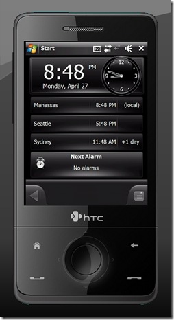
Doug: Sharing space with the weather is the clock. Tap this and you will open a second sub-panel. This one allows you to view the time in up to three locations around the world, which is great if you are a frequent traveler. From here, you can also view any alarms you may have set. Tapping the alarm panel, however, is where the illusion of Spb Mobile Shell takes a short break, because this will not take you into another Mobile Shell screen. Instead, this takes you straight into the default Windows Mobile Clocks & Alarms Settings. While I was a bit disappointed to find any path leading to a default Windows Mobile screen, I was pretty impressed by how far I had to dig before I hit it.
Clinton: Yeah, I kinda agree. It would have been nice for Spb to continue their reach down into Windows Mobile but to your point, you had to dig to get there in the first place. A suggestion for version 4.0? 🙂
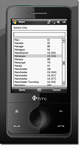
Doug: One final note on the Weather and Clock sub-panels. Both require you to set your current location. Given the fact that most devices now include a GPS, it would have been nice if these sub-panels could access the GPS to set your location. Instead, you have to select your location from a list. I was disappointed by this list, which really felt incomplete. My town, Bristow, was not included in the list, not were many neighboring towns. Many programs I have used, allow you to set your location by zip code. That would have been far preferable.
Clinton: I do agree that having access to the GPS would be helpful but I can kinda see leaving it off. There are still a lot of devices – think Windows Mobile 5.0 and 6.0 generation – that don’t have GPS and there are a lot of those out there. As for the zip code entry, TOTALLY agree. I home this comes in a .x release because that would be a super helpful feature.
Chris: I swear, Doug, we must be channeling each other. I had the exact same thought about the GPS integration. The fact that Mobile Shell won’t use zip codes is also a big problem. My town, Oswego, IL also isn’t included (though Oswego, NY is…go figure). I have to pick Naperville, IL (about 30 minutes East of where I live), and there’s not much else to choose from.
Doug: Exactly. Clinton, based upon my experiences with Windows Mobile 2003 SE, most developers I have talked with tend to aim their programs at the latest (or even upcoming) devices. So, it would not be a stretch to say many new and upcoming devices do include a GPS. Plus, I am in no way suggesting that Mobile Shell only allow you to set your location by GPS. Only that it should be provided as an option, in addition to the searchable list, and zip code search. Now that would be ideal.
Doug: The next zone on the Now screen gives you your communication indicators. This will show you whether you have any new email, text messages, voicemail, or missed calls. That last one on the right will also show your phone profile. I was a bit disappointed to find that the email and text message indicators jump directly into Pocket Outlook, which is really just not a great program. While I recognize that a whole new email interface would have been a massive undertaking, they could at least have offered a nice skin and better controls.
Clinton: Ha! This is why I love doing these dually or trifecta reviews! I love the fact that it goes straight to Pocket Outlook. For me it is great in that it takes me directly to where I need to be – no extra taps or clicks.
Chris: Ok…this is where we are NOT going to channel each other. I’m going to disagree with you a bit here. I don’t think its within the scope of Mobile Shell to provide a new e-Mail interface. You’re right in saying that it would be a big undertaking. It certainly would be. Snoopsoft Dashboard tried to do this with their own e-Mail plug-in, and while the result allows you to read e-Mail on your Today page, its not the most elegant thing in the world; and takes up a huge amount of RAM. The performance also leaves a bit to be desired. I think Mobile Shell is right on target here leaving the e-Mail interface to Microsoft.
Doug: OK, let me clarify that I am not suggesting Mobile Shell should replace Pocket Outlook entirely. Just that it would be nice if they had offer a better skin for the interface, and more finger friendly controls (such as those which are on the pop-up button in the rest of the interface.) That being said, the fact that Mobile Shell 3 allows you to add individual email accounts to the Lifestyle View is really a giant leap forward in my book.
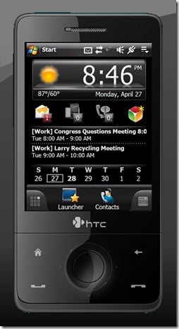
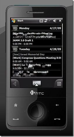
Doug: The final portion of the screen is the calendar and appointments. I have to say that my disdain for this portion of the application goes all the way back to the beginning. It does not offer enough space to show more than three upcoming appointments. Furthermore, the calendar beneath the appointments shifts around in order to make space. This means you are not likely going to be able to see this whole calendar unless you turn off the appointments.
Clinton: To a point I agree with you but really it’s no different than HTC’s TouchFLO 3D in this regard. With it you only see one or two appointments as well.
Doug: To be fair, I did have the same criticism of TouchFlo 3D when I reviewed it on my HTC Touch Pro.
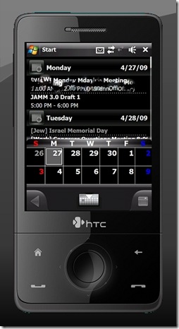
Doug: What is new here is the calendar sub-panel. Tap on any appointment or the calendar itself and this sub-panel (shown above) pops open. Honestly, you would never know that this was designed by the same people who brought you Spb Diary. I wish Spb had chosen to include a modified version of Diary, rather than this screen. I found the calendar and appointments sub panel just felt cluttered, and the color scheme and layout made it almost impossible to look at for more than a few seconds at a time. Finally, this screen does not feature any other traditional PIM information. Most notably, there is no way from within Mobile Shell to access your tasks. Considering this is a feature which has been requested in their forums since the Professional Now Screen was introduced, I had hoped this feature would have made an appearance by now.
Chris: I agree that this area is cluttered and doesn’t provide you with enough space to do or see much of anything. On VGA devices, it should be a little bit better (I have yet to install this on my ETEN V900); but on my Epix… ick! It really leaves a bit to be desired. I only see 1 appointment and a week worth of dates. There’s not enough room here to see anything or to plan out any part of your day.
Doug: Exactly! Even on the VGA screen on my Touch Pro, it really was not an effective interface.
Doug: On the bottom of the screen, you will find four buttons, which take you to Mobile Shell’s other features. On the far left is the entry to the carousel view. We’ll get into that a bit later, but needless to say, it is one of the cooler new features in the program. In the middle are the links to the Launcher Screen and contacts Screen. The far right button will open the settings panel. While you can open this panel from any screen, its contents will change depending upon where in the program you are and what you are doing. From here (on the Professional Now Screen) you can switch to the Lifestyle View (another of the program’s really cool features) and the Today Screen. This is really handy, because many Windows Mobile programs still rely heavily on Today Screen plugins, which cannot be displayed within Mobile Shell. The ability to switch back to your traditional Today Screen allows you to access any of these plugins.
Clinton: Agreed Doug. The two-taps to access the Today screen is great. I use Newsbreak for my RSS reader and having it only two-taps away is great. I really like the content aware settings panel as well. That really makes it easy to learn Mobile Shell 3.0 and have whatever settings or features you want/need a tap away no matter where you are in the shell. Greatness.
Chris: I also agree. I however, prefer to use Snoopsoft Dashboard to display Today plugins. That application is an oldie but a goodie, recently updated to work with WM 6.1, and specifically, the Samsung Epix. The fact that this view, and the rest of my plugins are just 2 taps away, again, is pretty cool, so we are all in agreement here.
Doug: Another great option for this is Second Today Screen.
Launcher
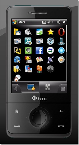
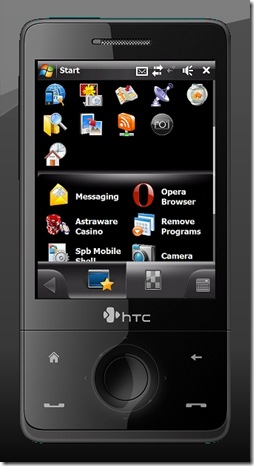
Doug: One of my biggest criticisms of Mobile Shell 2 was the launcher screen. Essentially, it amounted to little more than the Spb Menu with space for a small handful of quick launch icons. This interface, which did not necessarily allow quick and easy access to all of the programs I used most, was simply frustrating. All that has changed, however, with Mobile Shell 3. In this latest iteration, the two sections of the launcher screen have been divided into two tabs: Launcher and Menu.
Clinton: For me, the launcher in version 2 was acceptable. I found it handy and somewhat useful but there were points of frustration for me as well. Not in this new version though. It is fantastic and is so much better organized.
Chris: I like the fact that the Launcher has 2 different views (see below). The ability to change this view, allowed me to approach getting to my most needed apps in the most convenient way possible (and yes, I did change back and forth, as my needs seemed to change…)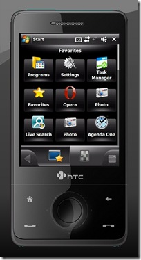
Doug: The top portion of the launcher tab contains your Favorites. Probably one of the best updates to this section is that the favorites are now unlimited. You can load any and as many programs as you will need quick and easy access to. And this includes much more than just programs. You can add messaging, settings, and other tools stored on your computer.
Clinton: 100% Agree. The ability to customize this screen (and many others for that matter) make this screen super fantastic. I like the fact that I can add just about anything as a favorite.
Doug: The only problem I had was that there is no way to easily rearrange the shortcuts stored in your favorites. This means there is no easy way to organize your favorites, or group things together. They simply appear in the order you place them. This also means that if you later decide to remove a favorite, you are going to end up with holes in your list, which can be unsightly and annoying. It may seem like a small thing, but being able to drag and drop favorites so they can be rearranged would have significantly added to the functionality of this screen.
Clinton: You can do it but you have to go into the editor and manually move everything about. Kind of a pain. I’d like to see an automatic alignment feature that could be off of the Setting menu.
Chris: This is a good idea, Clinton; and it seems pretty reasonable, too. This was also a pain point for me.
Doug: The latter portion of this screen contains your most Recently Used programs. I’ll be honest here, and tell you that I almost never used the recently used feature. That just is not how I used my device. But that is just me. Other people might have different uses for their devices, and might find this section to be more useful. This is one of the things that is great about Mobile Shell, no matter how you access the information on your device, you can do it from here.
Clinton: I actually like the recently used feature but I agree that this is likely more user preference than anything else. I use Recently Opened files in Vista as well so that should tell you something 🙂
Doug: The Spb Menu screen really has not changed much. Sure, you will notice the icons have all been given a facelift, which looks great, but in terms of the functionality, everything is pretty much where you left it, giving you access to all corners of your device.
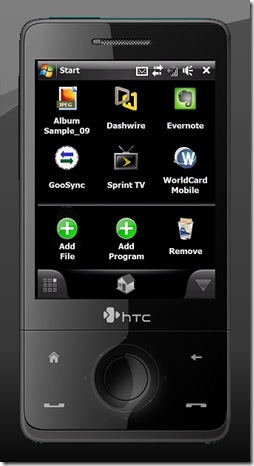
Doug: The biggest change you will find, however, is the customizable My Menu portion. In the past, this has been one of the most heavily criticized portions of the program. Although this was designed to be a customizable portion of the menu, adding anything to the menu was nothing more than an exercise in frustration, with a confusing and complicated interface. With Mobile Shell 3, My Menu has morphed into My Shortcuts, and customizing My Shortcuts has been completely overhauled. Now, instead of the confusing tree structure interface, you can choose between adding programs or adding files. These will take you to a list of programs or a standard file explorer-type screen, respectively. This is still not as easy as adding icons to tabs in Spb Pocket Plus, but it is still significantly better than what we had before. To say the least, it has taken My Menu from being an afterthought on my device, to being a central area for accessing certain programs in My Shortcuts.
Clinton: When I look at the changes in My Menu it shows me just how much work Spb put into the application and how much they listened. I am very happy to see this feature dramatically improved in v3 as it’s, well…usable now.
Doug: The other thing I liked about the new interface was the scrolling animation. In Mobile Shell 2, if you had more programs or shortcuts than could fit on a screen, then they were divided into pages. While you could choose a number of different animations to flip, swipe, or slide from one page to the next, the truth was it could get to be a bit cumbersome. Often, I would drill all the way down to the last page of the programs, only to realize that the function I needed was elsewhere in the program; which required me to flip, swipe, or slide, all the way back to the main menu. In the new version, everything is contained on the same level (unless you create subfolders), which means a single flick of your finger will send you scrolling down through the icons, and a single tap of the back button (from just about any location) will take you right back to the main menu. This is a fantastic improvement in this interface.
Chris: I have a WM 6.5 ROM on one of my mobile devices, and this scrolling animation is very much like the Start Menu in WM 6.5, (no secret or big news to anyone…) which, if I make my guess right, is what Spb was shooting for. This type of animation is something that most users will like, and possibly want, as they will be looking for that WM 6.5 look and feel for their device, especially if it doesn’t get an upgrade. I see this as a big win for Mobile Shell 3, as it will bring new life to older devices with enough punch to run it.
Contacts
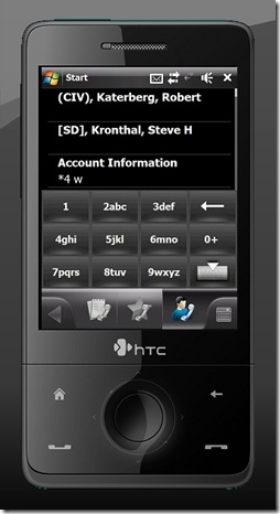
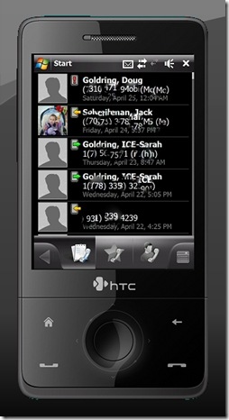
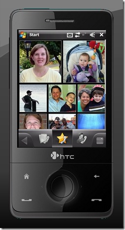
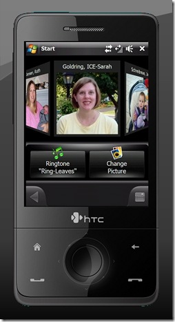
Doug: Like everything else in the program, the contacts screen has been significantly overhauled. Where it used to be a single screen with up to 16 contacts, it now features a multi-tabbed interface, with tabs for: call history, photo contacts, and address book.
Doug: The address book (formerly known as Spb Contacts) has not been significantly updated, nor would I really have expected it to. It is essentially an alphabetical list of all of the contacts on your phone. Just flick your finger to scroll through the list. It would have been nice if there was an alphabetical scroll bar on the side, like some programs feature, so you could jump straight to the first letter of the person you want to contact. With well over 1000 contacts, scrolling down to the bottom of the alphabet can be a bit of a chore. The good news, however, is the T9 style soft-keyboard (which can be hidden when not in use). Just start typing the name for which you are searching and the program will automatically start filtering through your contacts. Users of previous Spb programs, including Mobile Shell 2, should quickly recognize this interface.
Doug: The call history tab is pretty much what you would expect. It shows you a chronological list of calls, with color coded icons for incoming, outgoing, and missed calls. That is about it. You can scroll through the list, but there is no way to filter it, which I found to be a disappointment. Most apps will allow you to at least filter by call status. Still, in terms of keeping a record of your activity, this really does work well enough and is perfectly functional.
Doug: The final tab, and yes we saved the best for last here, is the photo contacts. There are numerous improvements over Mobile Shell 2. The most obvious is the layout, which allows limitless photo contacts (or at least considerably more than I was interested in adding). You will also notice that your contacts can be resized to small, medium, or large. The large and small photos made sense here. You can basically fit four small photos into the same footprint as a single large. The medium size, however, just does not quite fit into this paradigm. It would be nice if it was arranged so that, for example, a medium and 2 smalls would fit into a large footprint, but I could not make that work either.
Clinton: This to me is one of the greatest new features. I have a lot of contacts and being able to cram a bunch of them on the screen by setting the size to small is fantastic for me. This saves me a ton of tapping looking for a contact. I liked the old layout before but this is way better.
Chris: Sheesh! Ya think?! This is by far (in conjunction with Facebook integration, see below) is the biggest draw for me to use and continue to use Mobile Shell 3. I mean, who DOESN’T use Facebook?!?
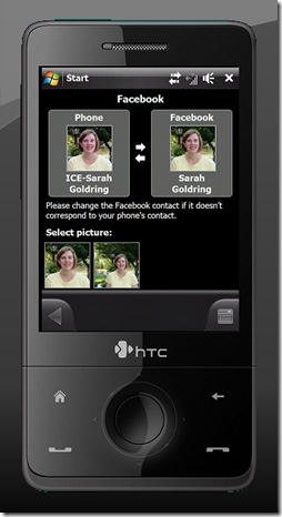
Doug: Well, since Chris mentioned it, let’s go ahead and talk about the Facebook integration. One of the problems I always have is finding photos to assign to each contact. This can be a real pain; especially for people I have not seen much in order to take a picture. Well, Spb found an ingenious way to solve that problem. You can just let your contacts choose the photo for you. Just connect to Facebook and Mobile Shell will search your Facebook friends for a match. You can then select any of their photos to attach to their profile picture on your phone.
Clinton: I have nothing more to add other than THIS FREAKIN’ ROCKS! The tie in with Facebook is just brilliant and shows the progressive thought of Spb. They get it – the whole social networking thing that is – and having this simple but effective hook into Facebook is just great!
Chris: In a word… “sha..!” I think you’re making the understatement of the year, Clint. I have a lot of contacts that DON’T have pictures, but those contacts likely have a Facebook account. Now, at the very least, I can put a new and often UPDATED photo with that contact, right from their Facebook account. The guy that thought this feature up definitely needs a promotion and raise. No… I mean it….REALLY!
Doug: Finally, you can arrange your contacts in a carousel view, which allows you to spin through your contacts’ photos. I never really figured out a good reason to use this screen, especially since I am generally already in my photo contacts when I would want to get there. But it is a pretty cool look at the kind of animation you can do here.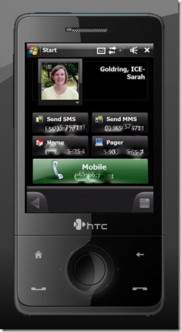
Doug: Now that you have your photos and contacts organized, let’s take a look at the fully redesigned contact cards. I always liked the contact cards which were introduced in Mobile Shell 2, and Spb has done a fantastic job of really adding to them, without affecting the functionality. When you open a contact card, you will be presented with a the contact picture and name. From here, if you tap the picture, you can resize or custom crop it from right inside the picture. This is a fantastic response to teh criticism or contact photos which ended up with their heads chopped off due to the program auto-cropping photos.
Beneath that are the main contact numbers: cell phone, home phone, SMS, pager. The large green button on the bottom is the last number you called.
Clinton: Having the ability to call, email, or text someone from one screen is just great.
Doug: I have to say that I was probably more impressed by the contacts view than almost anything else in the program. This is one area which, while it functioned fine, was the subject of a lot of criticism in the previous version. Much of this criticism dealt with minor details: you can only add 16 contacts, the pictures are not cropped right, contact cards are not organized well. Most of it was small, most of it was cosmetic, and all of it is more than addressed in this version. Very nicely done.
Alternate Views
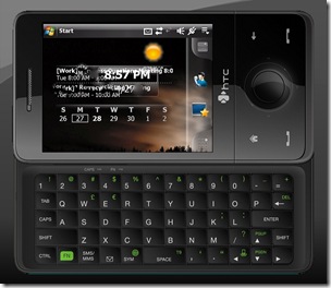
Doug: There are three alternate ways to access the Mobile Shell 3. One of these you have seen before, but the other two are sure to amaze. Let’s start with the old news. Like Mobile Shell 2, the latest iteration of Mobile Shell includes both portrait and landscape views. Until now, we have been pretty much focusing on portrait. In the landscape view, everything will still be on the screen, but that bottom bar will shift to one side, in order to allow the screen to rotate.
Doug: For the most part, this worked pretty well. But watch out for screens with custom arrangements, like the contacts screen and lifestyle view. These custom arrangements do not always rotate cleanly.
Clinton: The landscape view is great compared to version 2. Having used Mobile Shell 3 on my Advantage X7510, it handles landscape far better than before.
Chris: My Epix is already in landscape view by default (320×320 resolution is its default); so I really don’t see any difference in it vs. a portrait view. My Epix is already in portrait view by defaul… wait a minute..it’s the same thing.
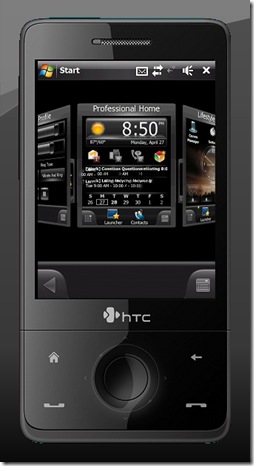
Doug: The second alternate view is the carousel view. You can reach this by hitting that button on the left hand side of the button bar. The one that looks like a grid. Carousel view consists of a rotating ball of panels. Just give it a spin and you can view all of the panels, in Mobile Shell. Jump to any one you want by tapping it.
Doug: From here, you can also swap the screen into the flattened grid view.
Doug: Aside from the fact that the carousel view exists at all and works as smoothly as it does, there are two really cool aspects to it. First, these are not generic representations of your screen. This is an actual miniature of each screen as it actually appears in your program. Pretty cool. But not as cool as the detail you can see if you look between the panels. Do that and you can see through to the inside of the circle where you can see the back of the opposite panel. Giving you the opposite side in reverse (from the inside) is just an incredible attention to detail.
Doug: The problem I had, however, was that there was really no good reason to use the carousel view. As amazing as it looks and feels, it does little more than look and feel cool. No screen in that carousel is more than a tap or two away from the main screen. In many instances, it is actually more difficult to switch screens using the carousel view. So, go ahead and marvel at what a great job Spb did with this one. And then check back in and let us know if you find any further use for this great looking feature.
Chris: I agree. You asked if I had something to say about Carousel View, and I really didn’t. This is why. I am having a hard time wrapping my head around why I would want to use something like that to go from screen to screen. You mention that all of the screens are no more than one or two taps away, and you’re right. I just don’t see the need for this feature, and see it as nothing more than unneeded eye candy.
Doug: The final new view is probably my favorite part of the whole program. This is the lifestyle view. Just slide your finger up or down the screen to switch between professional view and lifestyle view. What you are going to find here is a fully customizable blank slate. At first blush, it appears to be three separate panels. But in reality, it is one long panel, which requires three full screens to display. Look carefully at the images in the screen captures and you will notice that the background image is one large panel, not the same image three times as you might expect. Not only can you change the background, but you can add anything you want to this screen using the built in widgets. Just about anything that can be displayed in any of the other screens in Mobile Shell 3 can be added to the lifestyle view, including: programs, settings, contacts, indicators, even the calendar.
Doug: Pretty much the only thing you could not add here was individual media files. You could not create a shortcut to Word documents, music, videos, or Internet shortcuts. This is a pretty small complaint, but it would have been nice. More importantly, however, this would have been an ideal platform in which to be able to add today screen plug-ins. For example, it would be nice to add Spb Diary to the lifestyle view. But there is currently no way to do so. Hopefully, this is something which may be added down the road in a future version. Despite these slight omissions, lifestyle view is just amazing. It allows you to design the shell exactly the way you want it to look.
Chris: Lifestyle view…wow. You know, I’m not all that crazy about Lifestyle View. Its not that I don’t like the widgets or anything, but I really want to do more with my device than what is offered with LSV. If I were still interested in using my WM device as my music player (I stopped doing that in 2004 after I bought my first iPod…), then using something like LSV to swipe between the consumer based screens for calls, contacts and my music player would be great. Unfortunately, I’m more business oriented with my device, and want access to my calendar and tasks; and LSV simply doesn’t offer me that kind of data.
I also wasn’t very impressed with the type and amount of widgets that came with Mobile Shell 3. For example, I would love to see a Big Digital Clock, and the largest one that is offered is Medium. Where’s the GPS widget, or a Tasks widget?? Something like those would have been very welcomed…
Doug: I do agree that Spb could have done a lot more with this screen than they did. But I also have to keep in mind that this is their first attempt. I suspect that they will continue to refine and develop this screen, adding new functionality just as they have with other portions of the program. In fact, they have already added a space in their forum where you can request new widgets.
Conclusion
Doug: All I can say is Wow! I was involved in the Beta test of this program, but seeing the final version just completely blew me away. Mobile Shell 3 picked up right where the previous version left off. Not only that, but Spb has done a great job of listening to the criticisms of the previous version. Don’t like the reliance on the Spb Menu in the launcher? Now it is divided into two separate tabs. Don’t like the multiple pages to flip through as you hunt for that program? Now all those layers are removed, letting you scroll through all of the programs with a single flip of your finger. And most importantly, you wanted more customization, and Spb gave you the widget oriented lifestyle view. If you thought Mobile Shell was a critical application before (and we would certainly agree) then you are going to definitely want to check out Mobile Shell 3…the only app which can make Mobile Shell 2 look inconsequential.
Clinton: When I got my HTC Fuze I immediately fell in love with TouchFLO 3D. I found it so much easier to navigate my phone with and put a lot of my key information at my fingertips. With Mobile Shell 3, I’ve ended up moving away from TouchFLO 3D altogether. It provides such a rich experience and an abundance of data at my finger tips, making it one of my must-have applications. The improvements from v2 to v3 are substantial. There is still room to grow but it is clear that Spb have a hit with Mobile Shell 3.
Chris: Since getting my Epix, I’ve been looking for a decent alternative to the two Today plugins that come with it. Samsung Today just sucks weenies; and unfortunately, HTC Home or ANY version of TouchFLO simply won’t run on the Epix (did I mention that THAT sucks, too??). I have versions of Mobile Shell on other devices, and the E-TEN V900 comes with Mobile Shell 2 in its ROM.
I wasn’t very happy with Mobile Shell 2; but had heard some very good murmurs about Mobile Shell 3, and jumped at the chance to be a part of this review effort. Mobile Shell 3 is fast becoming a must have app in my device corral. In my opinion, if you don’t have an HTC device that can support HTC Home, or better yet, a version of TouchFLO 2D/3D, then you NEED Spb Mobile Shell 3. Its going to fill the gap between your fingers and your device, and make it much easier to use.
Doug: Normally, this is the part of the review where we would list off what we loved about a program and what need improvement. The truth is, however, that would be almost impossible with a program like Mobile Shell 3. Almost everything about it is absolutely incredible. Sure, there is room for growth and improvement, like in the lifestyle view, but these tended to be pretty minor details, which rarely affected our use of the program.
Chris: I couldn’t agree more, Doug. My day job is all about improvement and getting it right, so things like this are in my face all the time. Spb did a great job with Mobile Shell 3. While there are some definite opportunities for improvement within the app, it is VERY usable, and adds a great deal to any device using it.
Mobile Shell 3 is available from Spb Softwarehouse for $29.99. Discounts apply for owners of previous versions.



Fantastic review, guys. I have been using Mobile Shell for quite awhile and really feel 3.0 is a home run. I think you really captured the key points a user would relate to. My favorite feature is being able to switch between the Professional View and Lifestyle View. It is like punching out from work, once I switch the view I know I am done working for the day.
Some excellent points here. I too have moved away from TF3D to MS 3.x. Mobile Shell 3.x simply feels faster and more intuitive to me and is in many way easier for me to jump quickly around to get to pertinent information. the two-tap to get to the Today Screen is very nicely done IMHO, whereas in TF3D I had to use a 3rd party app to easily access it. I do wish there were Flexmail integration capability, but the Pocket Outlook is sufficient for me at present.
Agreed on pretty much all fronts – it’s cool. I was extremely impressed right after I started the beta as well and haven’t missed Touch Flo 3D too much. There’s a neat registry hack you can do to increase the number of screens in the Lifestyle view. Can find here: http://www.fuzemobility.com/add-more-lifestyle-to-your-spb-ms30/ or change the “PageCount” setting found here:
hklm/software/spb software house 2/spb mobile shell/widgets/homescreen
Authors indicate that they’ve had 10 pages working so far without any major issues, but indicate that you’ll want to test it out to see what works for you.
I still have to figure out all of the ins and outs of this program, though. I appreciate your review because it showed me some areas I was missing just because I hadn’t tinkered enough.
Thanks for the great review. I like the 3 perspectives in one review for something like this.
I downloaded the trial of this application and while I was impressed with the amount of effort that clearly has gone into this application, I was not nearly as enamored with it as you guys seem to be.
First – you really need a newer, faster device to run it. It ran poorly for me on a 64MB device, even one with a 624MHz processor. I would only recommend it on faster machines with at least 128MB RAM.
Secondly, and more importantly, I still feel like this is putting seat covers over your ratty car seats. They look pretty from a distance, but as you get close, you can still tell it’s a cover – not the original seats. I didn’t care for some of the places that the OS popped through. It still feels uneven and incomplete in parts.
Lastly – $29.95 is too much to pay for this type of application, especially if you have to add an additional $19.95 for SPB Weather. It is simply not reasonable for what it is. At minimum, there should also be an upgrade/crossgrade for users of SPB Pocket Plus.