I have long been a fan of Appigo’s iPhone apps. The company makes apps like ToDo and Notebook, and they’ve recently released an interesting cork-board app called Corkulous. Appigo’s apps are polished, full-featured and constantly getting better. Better still, as deep and complex as some of their apps are, everyone of them have worked perfectly from the day of their first release. Their apps are that good… seriously.
I was curious what Appigo would do with their apps given the iPad’s larger screen; I knew they wouldn’t simply blow the apps up to fill the screen, as that’s not how they do things. I had no doubt that, instead, they would make sure the apps were designed for use on the iPad specifically. I was particularly anxious for them to release iPad versions of ToDo and Notebook, which they chose not to release on iPad launch day. Instead, they took the time necessary to make a polished app that worked perfectly and “feels right” on the iPad. Well now ToDo for iPad is out and… it was worth the wait. To be honest, it is one of the first iPad apps that made me go “Wow!!”
Let’s take a look…

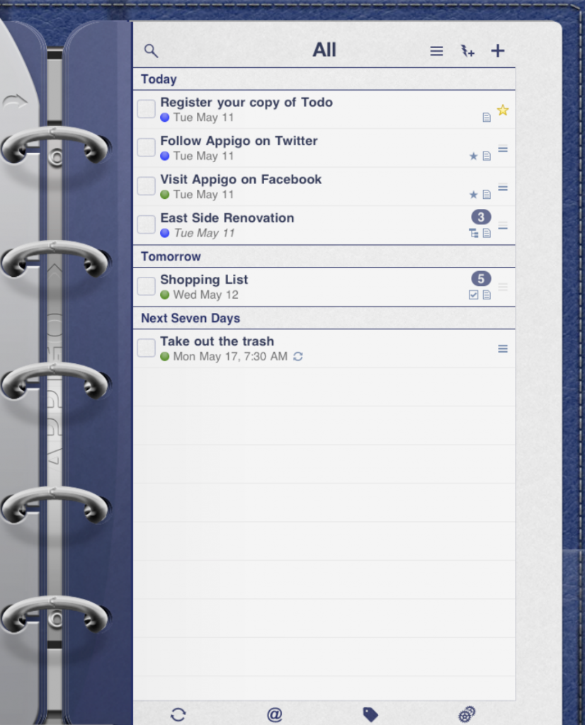
The app had the look of a three-ring binder. This type of “paper to virtual”port could come off as cheesy but with ToDo for iPad it works beautifully. It immediately makes the app feel familiar and comfortable. It looks good with the iPad in portrait but…
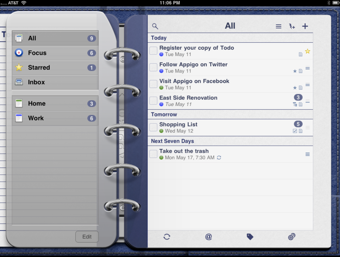
It looks even better when the iPad is held in landscape. As you can immediately see in this screenshot that larger size of the iPad means to can navigate through the app with tremendous ease. You various views and inboxes (for example “Starred” and “All” are always right there for you to access as you do your work.
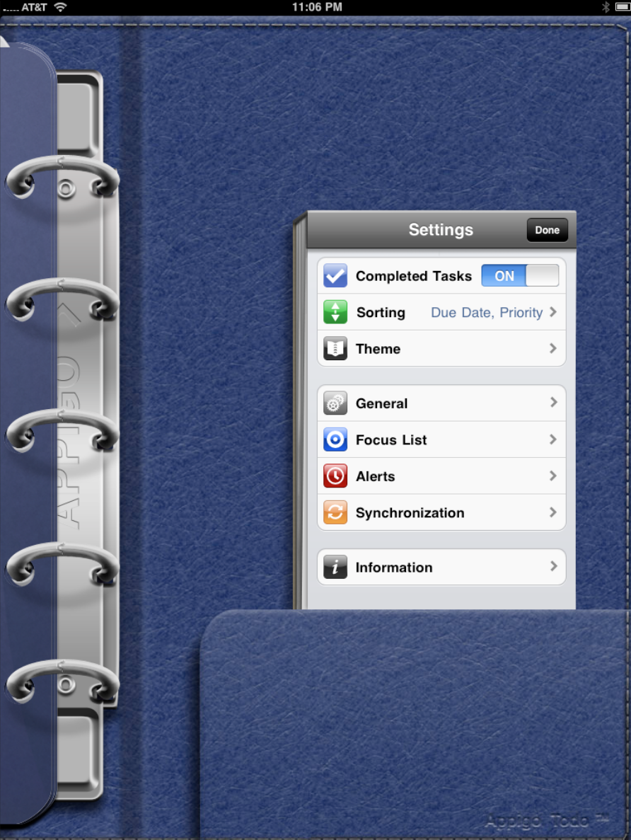
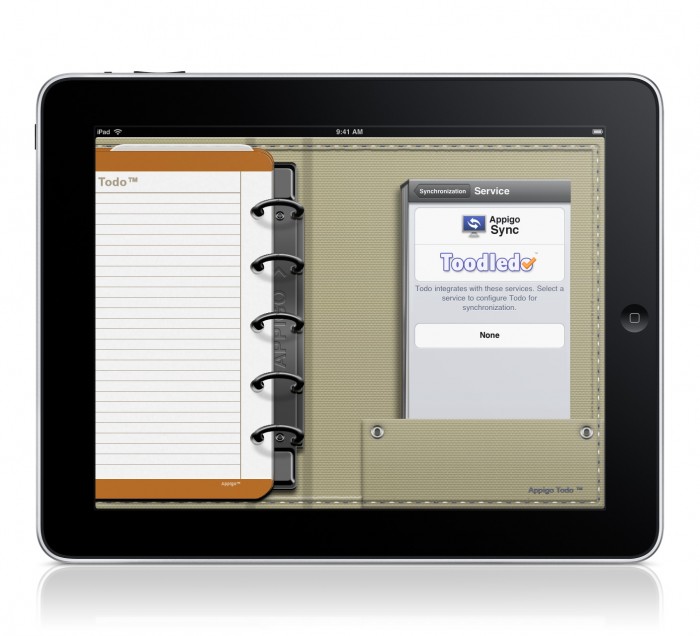
The first stop when you initially launch the app is the settings button. Interestingly, tapping it brings up a settings window that is exactly like the one of the iPhone. It looks the same (which makes it familiar if you have used ToDo for iPhone), and it is also the same size.
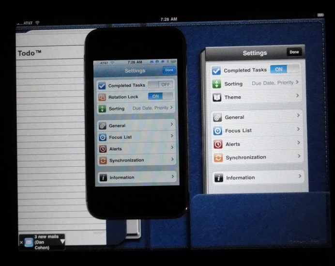
This makes sense since there is no reason for a larger window. Personally I like the way the Setting window looks like an index card sitting in the binder’s pocket. It makes the notebook effect even more real.)
The first setting you want to visit is the sync setting. The great thing about ToDo is that you can use it without any sync service (personally I’m not sure why you would since you at least want to sync to back up data) or choose to sync with Toodledo or Appigo’s own desktop sync service. I use Toodledo and have been exceptionally happy with it — despite a major server fail last summer, the service is remarkably fast and reliable.
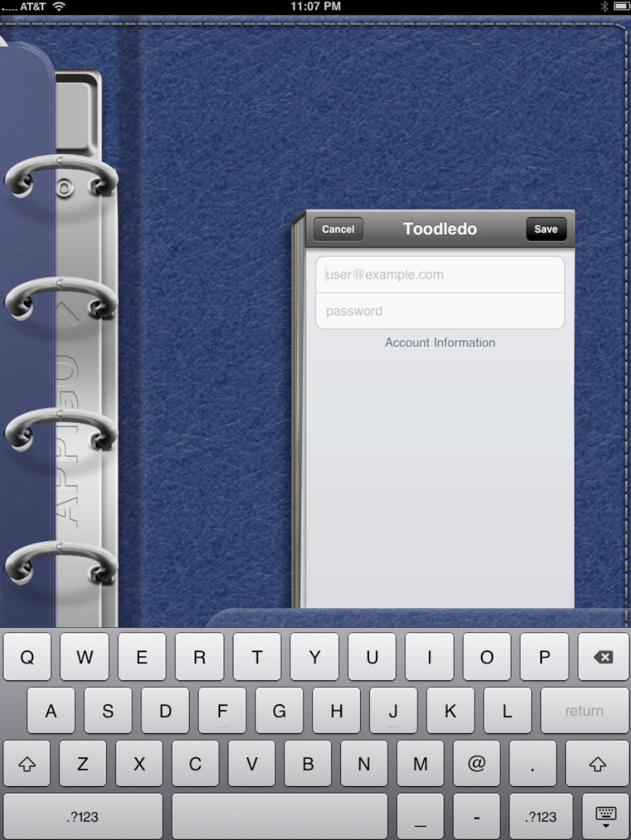
I input my account data…
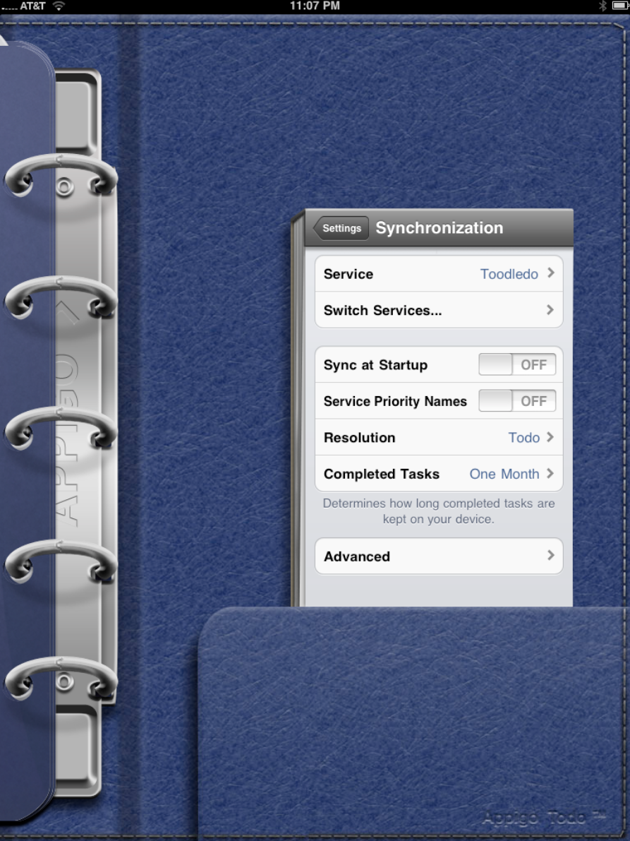
…made some sync selection such as whether I want the app to sync as soon as it starts or not (I do but it does slow the app’s launch a bit), and whether or not you want to see tasks once they are completed.
After that is done it is time to customize the app a bit.
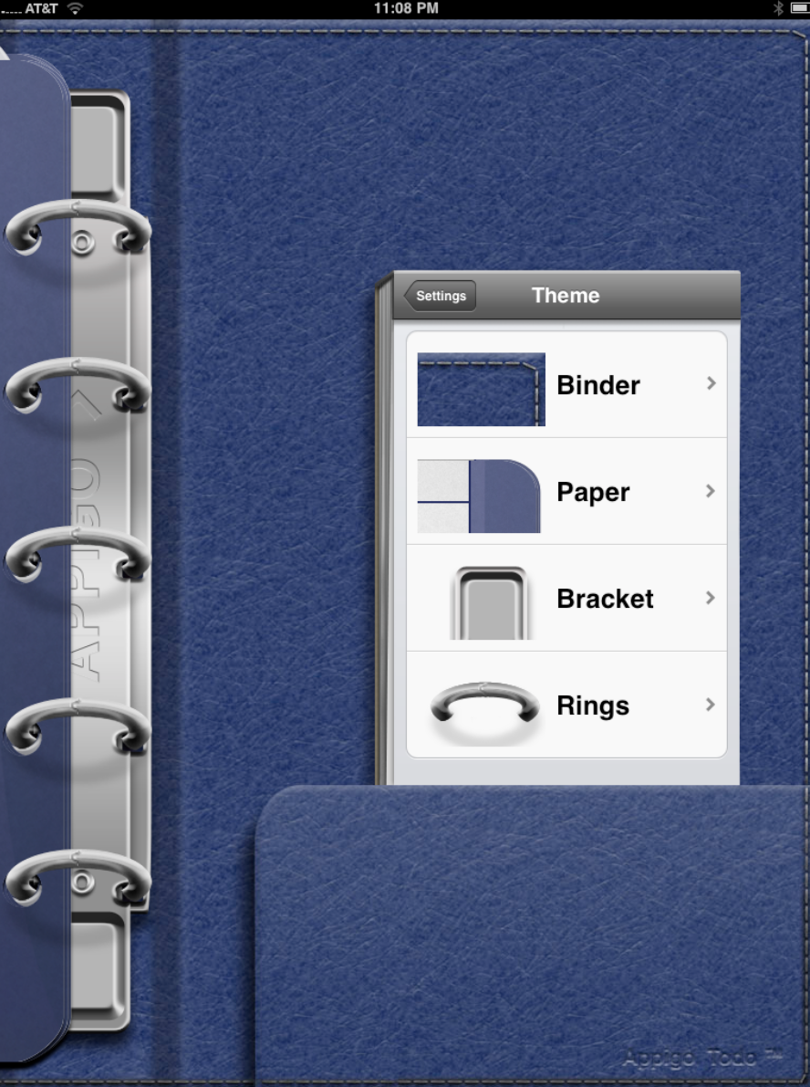
ToDo for iPad let’s you choose the color of the binder, the paper, the bracket and the rings.
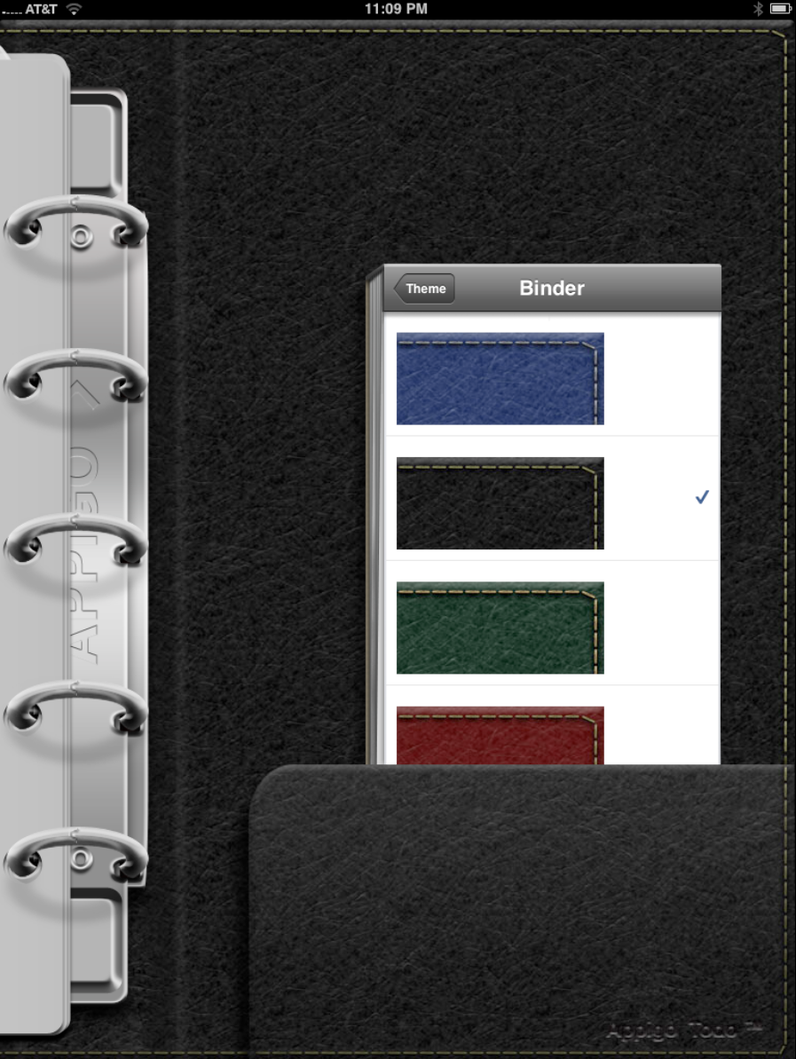
You can change the binder to one of four colors. ?
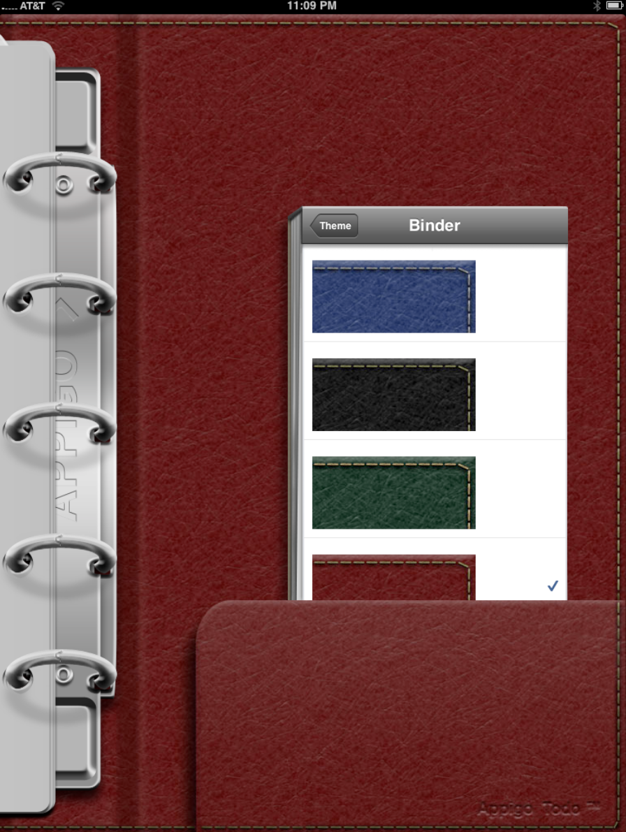
As you can see that one chance alone makes a difference in the look and “feel” of the app.
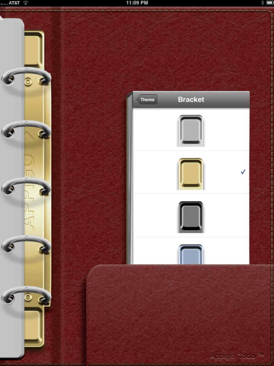
The bracket color can also be changed to one of four choices.
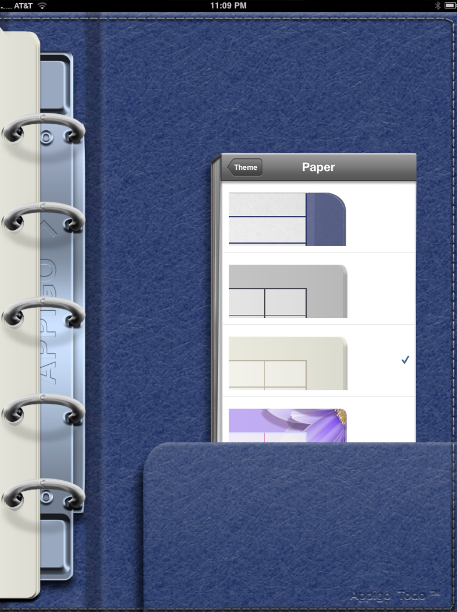
The paper and the rings can be changed as well. In all I love that there is enough choice to make the app your own, but not so much as to make it complicated.
There are a few other settings you will want to look at but lets jump into the task part of the app…
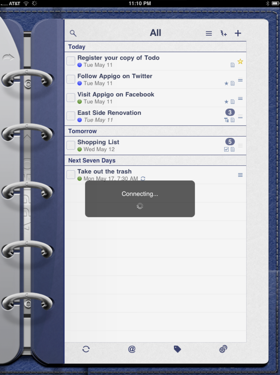
If you set up a sync service the app will immediately connect and sync your data. I love the fact that by using Toodledo as the underlying engine I know that my information is not only backed up but is mirrored on my iPhone and on the web. Similar to Evernote in this regard, I believe this sort of “hybrid-web app” is the ultimate destination for all applications. Data will no longer reside exclusively on your device or in the cloud but rather will be in both places all the time.
As you can see in the above image the tasks are easy to see and read and the additional information such as stars, notes or type of task is easy to see thanks to the iPad’s large screen.
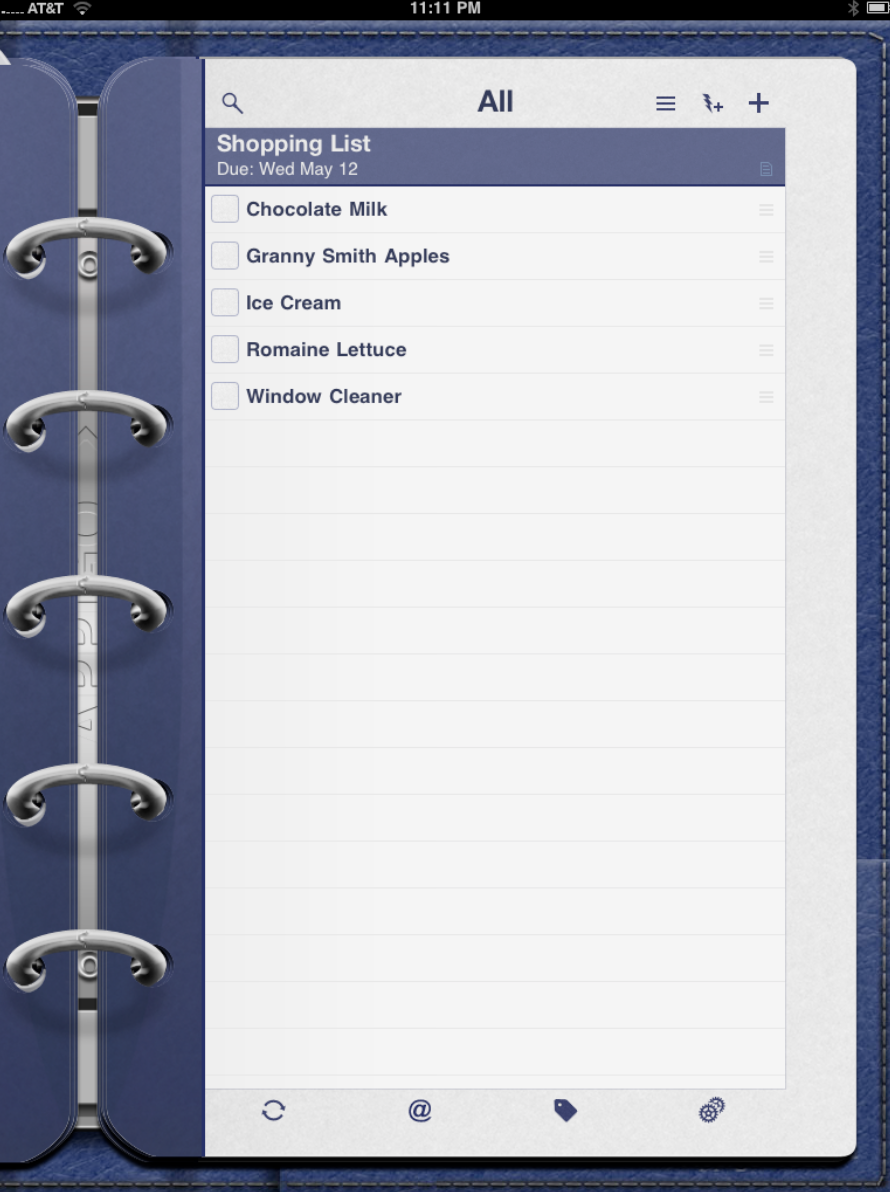
One type of task is the “List”. It creates on task with numerous sub-tasks beneath it. Again, the screen is so large that is it easy to see, manipulate and check of when completed.
That noted however I doubt you would want to carry your iPad in a store while wheeling around a shopping cart. That’s where using a sync service like Toodledo comes in handy. I can now create and manage my shipping list on the iPad, but then…
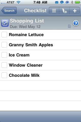
… use the version that will automatically appear on my iPhone or touch when I am on the go.
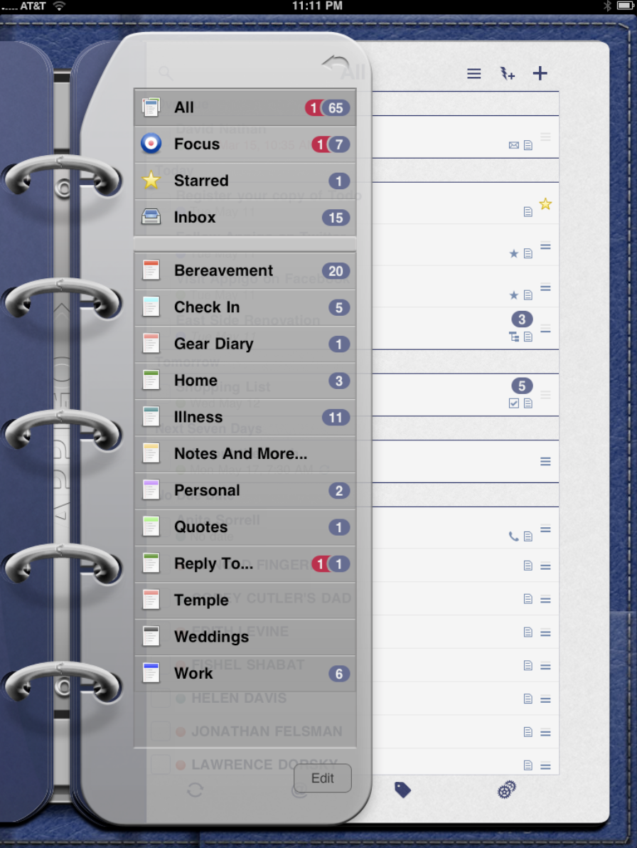
If I have organized my tasks into different lists, then I can easily see all the lists, the starred items or (I love this feature of ToDo) my Focus list of important items.
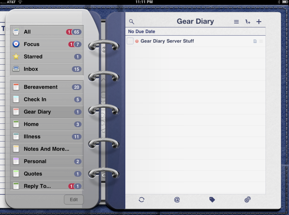
Tapping on any one will reveal the tasks under that specific heading.
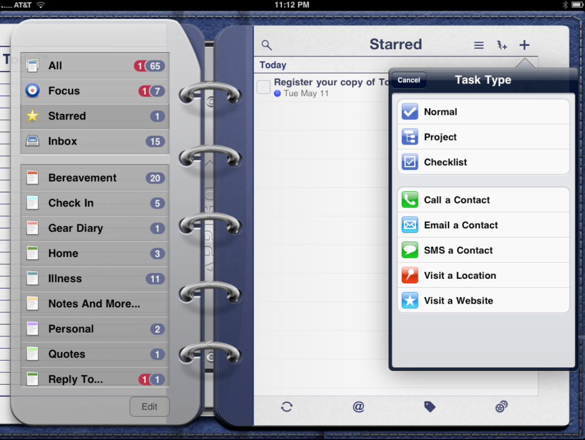
If I want to add a task, I can tap either the Plus sign to start a new task with all the relevant details or I can tap the lightning rod that will let me quickly create a new task and the, at a later day, fill in the detail.
![]()
The ability to quickly create a new task is quite helpful when you are in a rush but don’t want to trust your memory.
![]()
New tasks can take a number of different forms. There is a straight forward task or “Normal”. There is a “Project” task which will have nested items beneath or and there is the “Checklist” task which will have a series of individual items beneath a larger heading.
There are also specific types of tasks like the “Call a Contact”, “SMS a Contact” or “Email a Contact”.
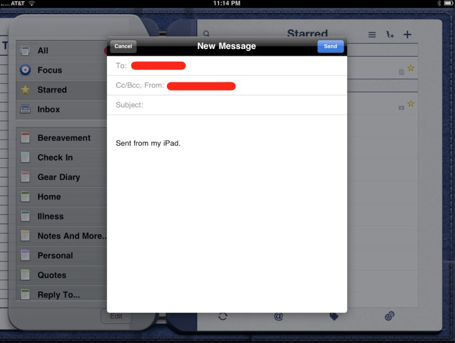
The “Email A Contact” task type is great. When the time comes you simply tap the item and a new email is created with that individual’s address already input.
The Call and SMS tasks are a different story. On the iPhone tapping them initiates that activity. On the iPad it works differently since it does not have a built-in phone. Even the iPad WiFi + 3G doesn’t add the functionality. The result is that tapping on them does… nothing. I asked the company about this and, as usual, heard back quite quickly. (They have awesome customer service.) Leaving these types of tasks in was a conscious choice, since it means you can create the task on the iPad but then actually DO the task on the iPhone. It is the right call in my opinion, but they need to make this more clear since it looked like a coding error to me at first.
In addition, I would like to see the app integrate with textPlus and Skype, since that integration would make it possible to text or call directly from the iPad.
And speaking of integration, while I love being able to sync with Toodledo I would also love to see Appigo use the Evernote API with ToDo. Evernote is not designed to be a task service but such integration would be a great way to back up tasks. Since everything else in my digital life is in Evernote I would love to have a copy of my tasks there as well.
In all, ToDo for iPad is a gorgeous application that is as functional as it is nice to look at and use. It works perfectly, has numerous ways to customize both the look and the function of the app, and it is the best task manager for the iPad bar none.
ToDo for iPad is currently available for $4.99. That is a bargain in its own right, and considering the iPhone version is $9.99, it is a steal. It also means the price will likely go up soon so if you are interested in the app you should grab it now.
What I Like: Gorgeous, amazingly stable, syncs with a choice of services, is highly customizable, lets you seamlessly move from iPad to iPhone and back, knowing Appigo will only get better with time
What Needs Improvement: The non-functional “Call” and “SMS” tasks need to be carefully explained so they don’t look like dead shortcuts. Better still, integration with textPlus and a VOiP app would make the app even better.
