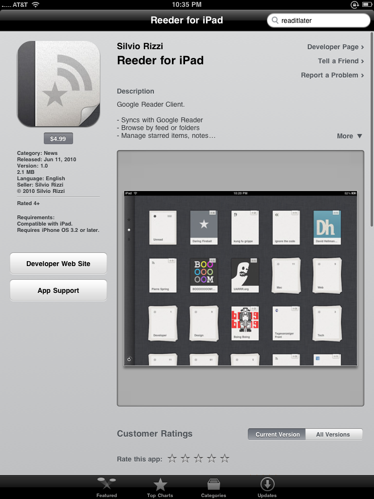
I’ve tried them- RSS readers for the iPad that is. Seriously… I have tried pretty much every RSS reader that is available for the iPad. Why? Because the iPad is the perfect platform for catching up on numerous feeds quickly and easily and I don’t love the Google Reader web interface. Yes, I’ve tried them all and have been disappointed in all of them for one reason or another. In the end I started using the iPhone app Reeder and applying the “pixel-doubling” to it. The text and images weren’t the ebst but the RSS reader had everything I wanted feature-wise, was super stable and synced with Google Reader faster and more accurately than anything else I had used. Thankfully I no longer need to do that.
Reeder for iPad was released the other day and it is as good as I hoped it would be. In fact… it is better. It is fast, easy to use and the various “buttons” and settings are exactly where I want them to be for ease of use and comfort. Let’s take a look…
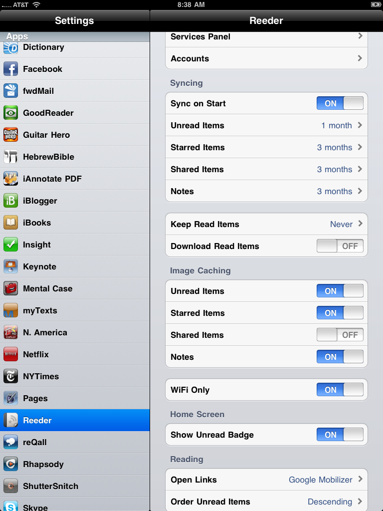
When you first start the app you’ll cant to go into the settings and set things up. The settings are plentiful but straightforward enough to make the process easy enough. Add in your Google Reader information, decide what items you want and how often you want them refreshed and kept and…
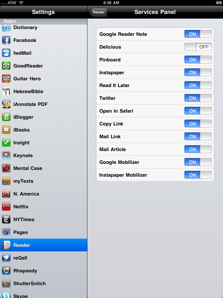
… input those services you plan to use with it. As you can see they pretty much covered all the bases.
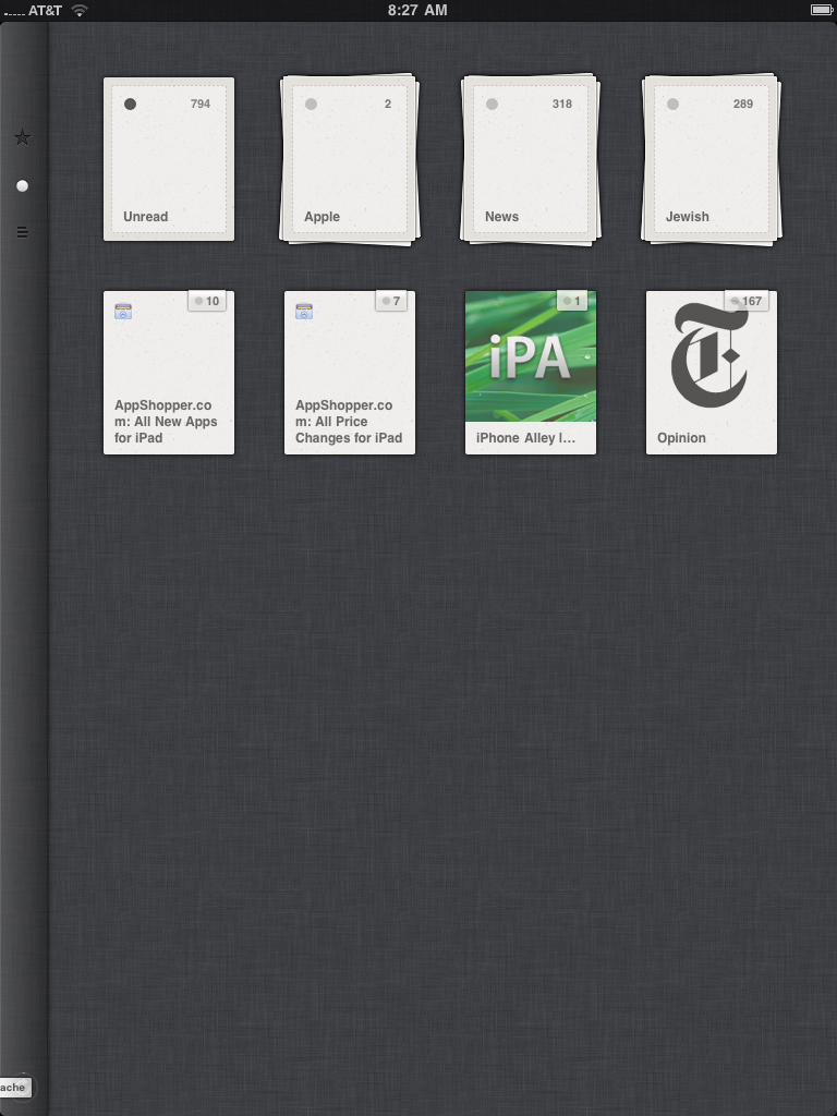
The app displays your feeds in three ways. The one I use most is he “Folders” view. It isn’t the most attractive view but it gets the job done just fine.
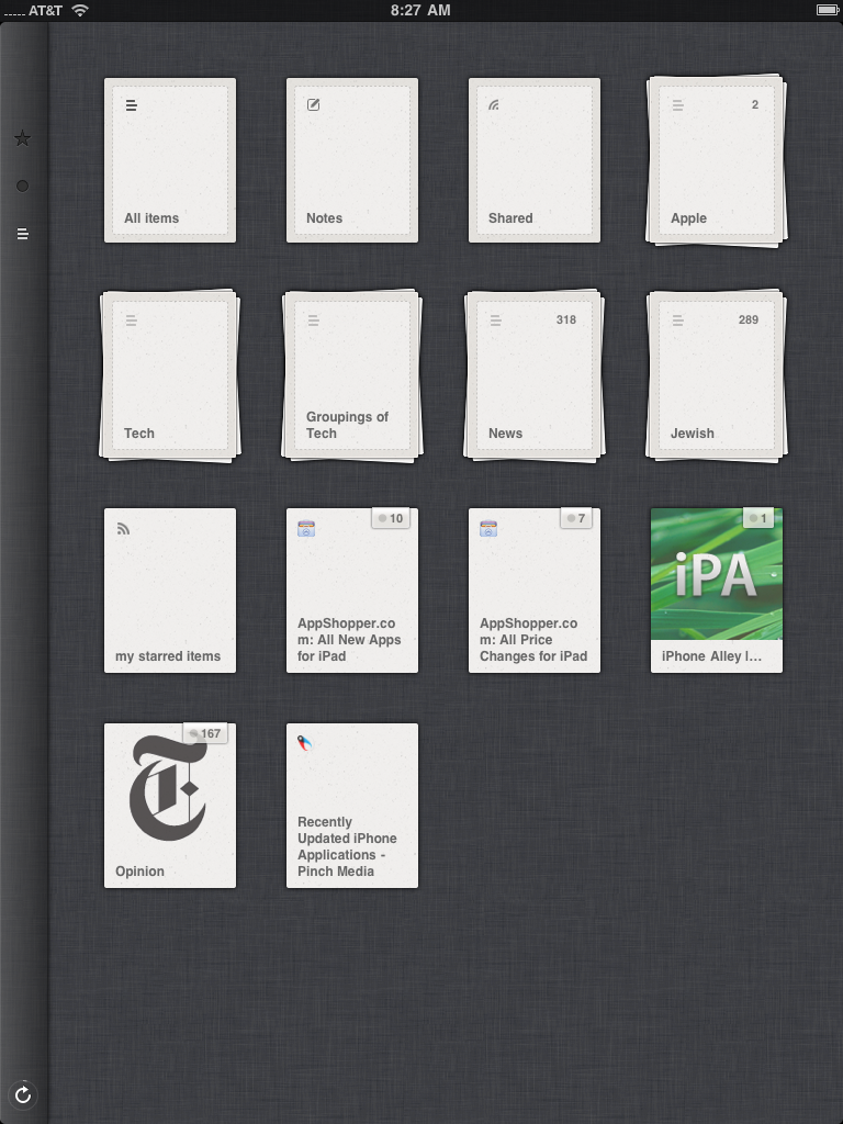
This is the other view I use a lot- the individual feeds view. It looks the same but presents each feed as its own “stack” instead of grouping them together.
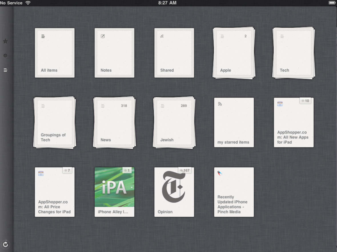
It maintains the same format when the iPad is held in landscape.
What I like most here is that the feeds or groups are easy to see but are kept distinct from one to the next. Even with a lot of feeds or groups you don’t feel overwhelmed by the shear number of them.
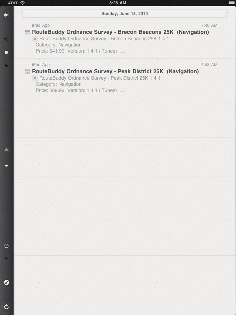
When you select a group the app shows you the individual articles in it. If I have any criticism of the app at all it is the minimal contrast it uses. Mellow tones are good for an RSS reader but, like the iPhone app, these are a bit TOO mellow. The iPhone version has increased the contrast. The iPad needs a lot more and the iPhone could even do with some further tweaking in this arena.

Select an article and you get a nice, easy to read, rendering of it.
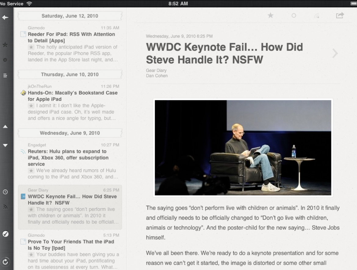
In landscape you even get a list of the other articles you can read.
In BOTH cases notice where the “next”, “last”, “go back” and “refresh” buttons are… EXACTLY… they are right where your hand goes if you are holding the iPad with two hands the way Steve is in the picture. THAT is what makes Reeder stand out… they rethought how we hold and use the device and came up with a better layout than anyone else has. At least in my opinion…
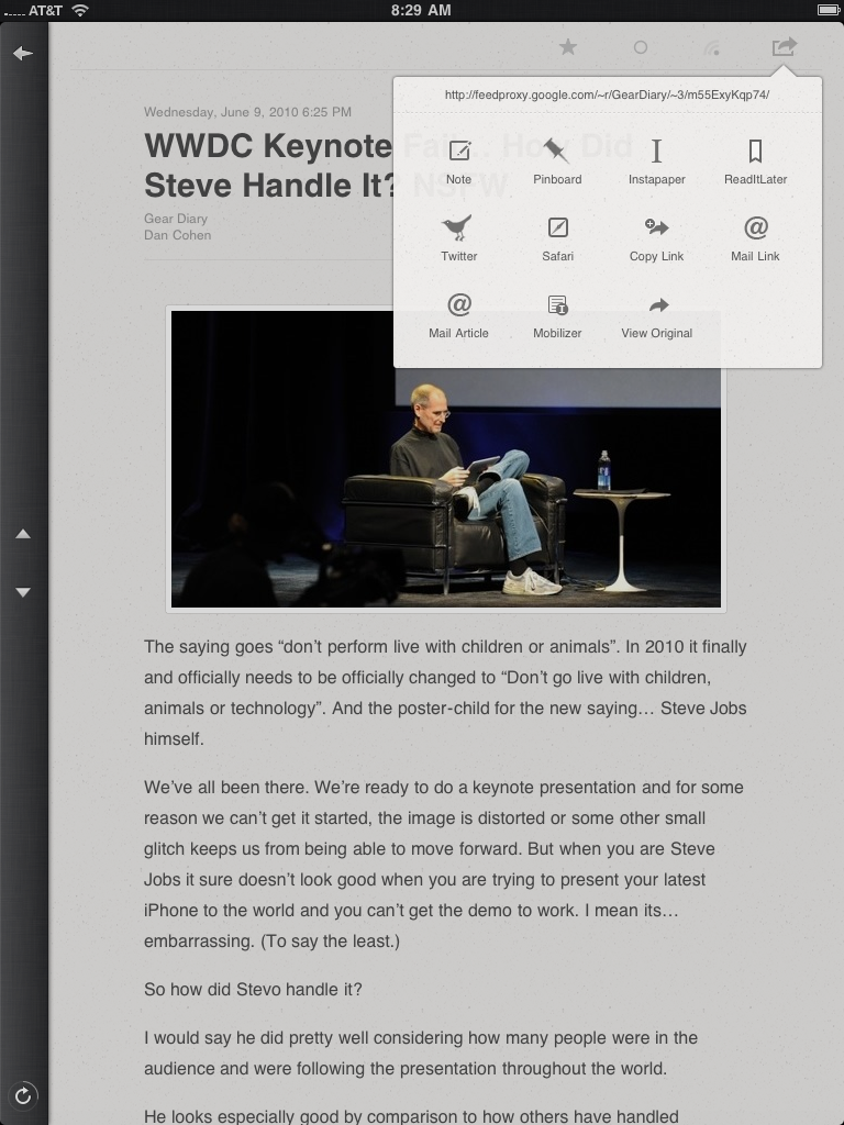
Tapping in the upper right of the screen gives you a host of choices for how to share or save an article. They pretty much included everything and in the settings you can choose which to have active and shown and which to hide.
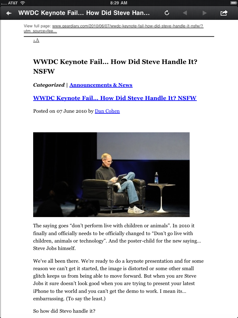
Choosing to render an article in Google Mobilizer gives you a version that is easy to read. At the same time…
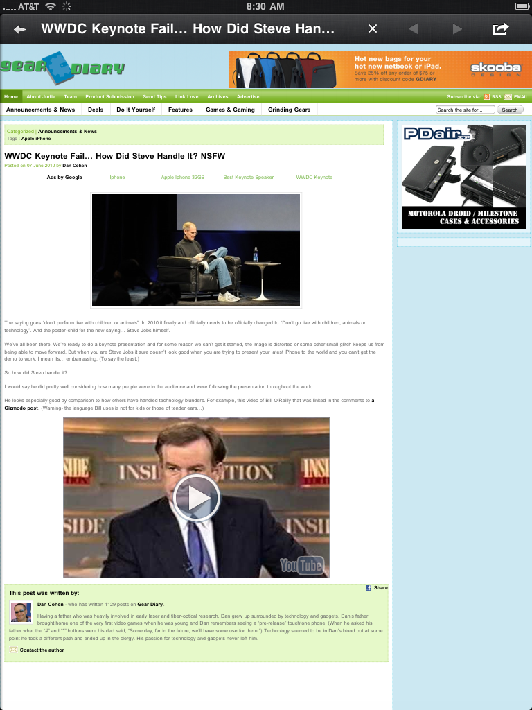
You can also view the original page without leaving the app. (From there you can even browse to other pages while still remaining in the app.)
In all Reeder is everything I hoped it would be and more. It finally brings to the iPad an RSS reader that really “gets” the iPad. To mind mind it is well worth the $4.99 pricetag.
You can grab it here in the iTunes App Store.
What I Like-
Fast… really fast even with numerous feeds, easy to navigate, buttons are placed perfectly for the way I (and I suspect others) hold their iPad, has a full compliment of sharing services, feels polished and refined even in this first version
What Needs Improvement-
The app needs an option to set the contrast to your individual liking,
I don’t love apps whose name intentionally misspells a word in order to not need a multiple word title. Better they should call it something like-
“Finally an RSS Reader for the iPad that doesn’t suck”
