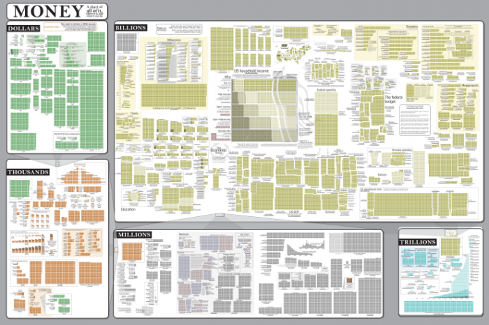
Have you ever looked at the amounts of money our government and large corporations toss around – billions or even trillions of dollars – and tried to break it down into something more ‘real’? Well, this week’s xkcd comic does just that.
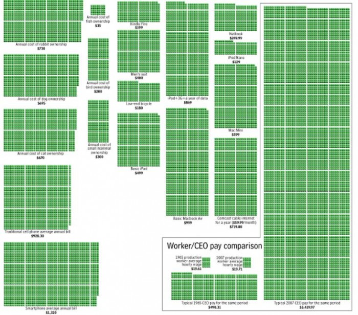
Much of it is just informative, making proportional chunks of blocks for how much an iPhone costs or dinner out at Outback Steakhouse. But there are images like the one above, showing that while for most people the standard of living has not improved in almost 45 years, for the average CEO things have improved by more than an order of magnitude.
Here is the full map – but in a scaled-down that allows you just to see the progression from dollars to thousands to millions to billions to trillions. It is amazing to just pan and scan around the full map!

