This isn’t in any way a political post, it is just a reflection on how the visual display of information impacts out perception.
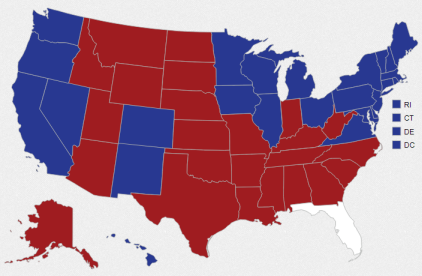
Look at the image above; it might seem inaccurate to say, based on the image, that ‘most of the country voted for Romney’. But that image is based on land mass, and since our country isn’t uniformly populated, that graph doesn’t really serve the intended informational purpose.
Some people might only care about the basic result, such as this one from the New York Times:
Others are looking for more, such as the margin of victory for each of those states, which is what the Wall Street Journal uses:
That shows that there were relatively few states with small margins of victory, and also that the most polarized states had very few electoral votes.
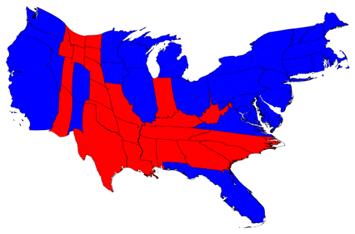
But for many, that doesn’t get to solving the initial issue of how the map can look so red, yet have a ‘blue win’. Now if we take the image at top and warp it using a graphing technique called a ‘cartogram’ that resizes states based on their electoral votes, here is what we get:
And that is pretty much it in a nutshell – the ‘red’ areas of the country are largely devoid of population centers (aside from Texas, of course). Politically this makes sense, as the issues impacting farm owners and rural dwellers are often different than those that concern city-dwellers and suburban office workers.
But while for many this is all that is needed to explain how the electoral college worked to produce a relatively large electoral spread when a basic map seemingly shows an entirely different result, for me that Wall Street Journal graph teased with the way the votes WITHIN the states were distributed.
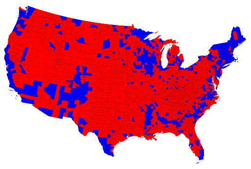
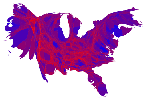
One option would be to simply use a shaded color code in the cartogram above and that would work … but what if we start with a county by county look at the vote distribution? As you can see below, that distorts the results even more, since it exaggerates the impact of those ’empty’ counties with large land mass.
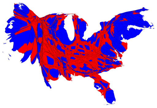
Using the cartogram method again illuminates the impact of population centers – and shows just how much of the ‘electoral mass’ is dictated by a relatively small amount of land mass. No wonder ‘gerrymandering’ is so much in the news once again (the practice of trying to realign districts to influence the power structure on a local, state or national level, although this time around the GOP is catching heat for it).
But that graph assigns colors on a binary basis – red or blue, winner takes all. But in reality since counties are not decided in a binary manner, it makes sense to allow the relative distribution of votes within a county to take on a different color – and in this case we start with red on one side and blue on the other, with hues of purple in between; this is more instructive and useful:
What we see here is that there are some pockets of red and blue, but most of the country is some shade of purple. This is why it is good to remember that it is normal and healthy to have neighbors supporting different candidates and parties for their own reasons, unlike on Facebook where failure to align made you either a fascist or a communist to some people.
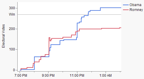
Did you watch the election? If you did, then you likely saw the ‘march to 270’ electoral votes proceed somewhat like the graph below:
I remember my older son looking at the results right after 9PM and being very concerned about the outcome of the race, as if the closing of the west coast polls at 11PM would mean that Obama would ‘run out of time’ to catch up. What I explained was that the chart was based solely on ‘called outcomes’ based on poll closures, and therefore didn’t reflect the reality of the situation.
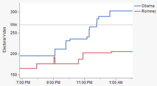
What I meant is that while we had to wait for the polls to close, I could have called Oklahoma for Romney in September (he won by >30%). Same for Tennessee or Texas for Romney, or Massachusetts, New York or California for Obama. If you take that into account, or take into account Nate Silver’s 538 blog predictions as a starting point, here is what you would see:
That shows that once you get all of the pre-determined states out of the way, the night was much less exciting to watch … and since I really enjoyed sharing election night with my wife and boys (both of whom will be old enough to vote in 2016), I think having the intrigue of the former graph might have actually been a good thing!
This post contains graphs and inspiration from here and here. Thanks!
