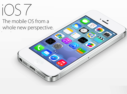
Although there has been no official announcement, Apple will likely release iOS 7, the next generation of their mobile operating system, next month. It is the biggest overhaul to the OS since its introduction, and while visual differences will draw most of the attention the changes that are less apparent are the ones people will truly love… Or hate.

I’ve been using beta versions of iOS 7.0 since it was first available a few months ago. I’ve used it on my iPod touch, an iPhone 4 and an iPad 2 and mostly like what I have seen. My biggest concern with the update is that it actually changes the way certain core tasks are done on the iPhone or iPad. People tend to be change-averse and that is especially the case when things they do quite naturally suddenly require different behavior.
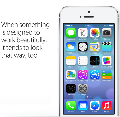
To help prepare any of you using iPhones, iPod touches and iPads for the iOS update we are going to offer a series of simple, direct Gear Bits that highlight some of the things you will want to keep in mind. In order to respect the NDA covering the use of Apple Beta software I won’t show any pictures of the OS on my actual devices or speak directly to my experience using it. Thankfully Apple has shared enough on their own website so we will use their images and descriptions to highlight some of the key changes.
Our hope is that these short posts will make the move from iOS 6 to iOS 7 a bit easier. Trust me, becoming familiar with some of the changes iOS 7 will introduce now will be worth the effort when Apple lets it loose on the world next month.
So here’s iOS Tip Number 1: Take Time To Become Familiar With the New Icons Now
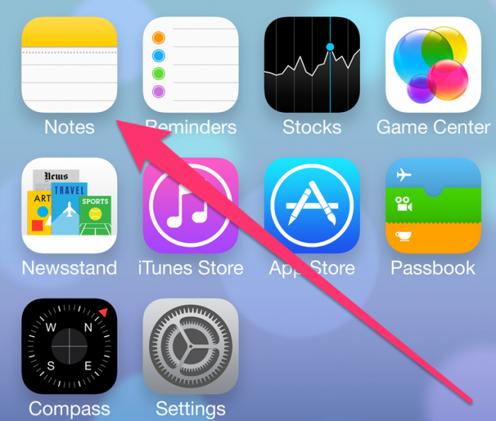
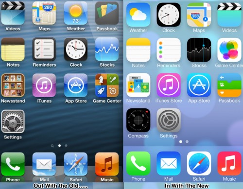
Along with creating a UI (User Interface) that is “flat”, Apple saw fit to change the icons for some of the stock apps that ship on the iPhone, iPod touch and iPad. That won’t be an issue for someone who is new to iOS but if, like me, you have been using Apple’s mobile devices since the very first iPhone, it actually presents a challenge. For example, the Notes Application has an entirely different icon which has, more than once, had me searching for the app even though it was staring me in the face. Passbook, Newstand and Settings are similarly changed. The Photos app is as well.
Taking the time to get to know what the new icons look like now will help make the transition next month. Better still, now would be a great time to revisit how you organize your App folders and make sure you use the same organizational approach on all your iOS devices. (That assumes you have more than one of course.) Going by location rather than look will keep you from hunting around for a once-familiar app that is suddenly wearing a disguise.

