I didn’t begin today thinking, “Boy, I better review the Wired Magazine iPad app, or Judie will really get on me”. Nope; I have lots of other stuff on my plate, including news items and reviews of other apps (e.g., Mushroom Age!). But as I sat there waiting–and waiting and waiting and waiting–for the one issue I bought to download, I ended up writing a review in my head, so I figure hey, better get it down.
Here’s the history: I loved Wired magazine. Loved it. I used to wait for and immediately read every issue, almost cover-to-cover. Yes, it was such a visual magazine that, as Neal Stephenson observed, you practically needed to wear welding glasses to read it. Yes, the deliberately-bizarre layout and formatting could get on your nerves. Yes, it got tiring after a while to read Nicholas Negroponte go on and on and on about “bits vs. atoms”. But still, with the usual exceptions that any magazine has, the articles were interesting and often thought-provoking, and the gizmos inside were cool. It was Time Magazine for nerds, basically.
So even though I haven’t read Wired regularly for years (dating back to about 2001 or so, but definitely since they were purchased by the evil Condé Nast empire), I was excited to see that it was one of the few magazines that were designed to be used on an iPad. And when I finally go my iPad, it was one of the first apps I downloaded.
Here’s what Wikipedia has to say about the app:
On May 27, 2010, Wired released its Tablet edition, first available on the iPad. Embraced by consumers and heralded as the beginning of a new era in publishing, the Wired iPad edition was downloaded an average of 17 times a minute for the first 24 hours, netting 24,000+ paid subscriptions. Over the ensuing days, Apple named the Wired Tablet Edition, “The App of the Week,” making it the first media brand to earn this acknowledgment; and the Wired App remained the #1 Paid Download on iTunes for 5 consecutive days. Close to three weeks following the release of this Tablet Edition, Wired had sold 90,000+ copies – exceeding the average monthly newsstand sales of its print edition
Boy, was I disappointed.
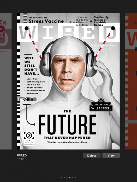
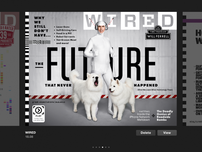
The Good: the app looks great. It retains that Wired “look and feel”. The images and inserted film clips use the iPad’s large, HD screen to good advantage. It’s also kind of fun that there are two covers for each issue: a landscape cover, and a portrait cover.
Issue 18.08 cover, portrait mode . . .
and landscape mode
Unfortunately, that’s pretty much it as far as the positive stuff goes.
The bad: the app is a pain to use. It doesn’t download new issues in the background, which means that you have to leave the app open the entire time you are downloading. Further, you can’t do anything else in the app itself while you are downloading. And since each issue is about 400 MB, it takes a pretty decent amount of time to download (somewhere between 15 and 20 minutes on my home network). You can’t read the issue while it’s downloading (like you can’t in Zinio), nor can you read any of the other issues that you have already downloaded. And it won’t load in the background, so all you can do is start a download and wait. And wait. And wait. Major fail.
Will Wired update it to use the backgrounding capability of iOS 4.X when it is available for the iPad? Heck if I know. But in the meantime, like I said: fail.
The layout of the issues themselves is linear–you have to scroll through the issues one at a time, from left to right, including issues that you haven’t bought. This is not that big a deal right now with the number of available issues so small, but do you really want to look through all the issues of Wired when you only bought a few? I sure don’t.
Further, the view is not configurable. In iBooks, for example, you can look at your set of books as a list (sorted by Author, Title, Purchase History, or whateer), or you can look at them in “bookshelf” view. In other readers, you have other options as well. In the Wired Mag app? Linear, left to right, including every issue. Non-configurable. Another fail.
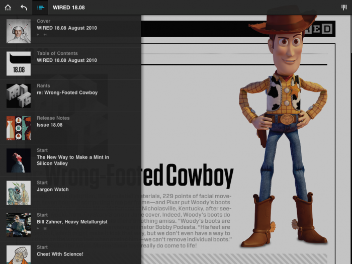
All the controls available are in this screen shot–not much there, is there?
(You can’t even archive issues. Really, it’s a pretty unfriendly app.)
And it’s a little thing, but it bugs me inordinately that I can’t see the clock when I’m in the app. I can see it in the nook app, and the Kindle app, and the eReader app, but not the Wired app. Why not?
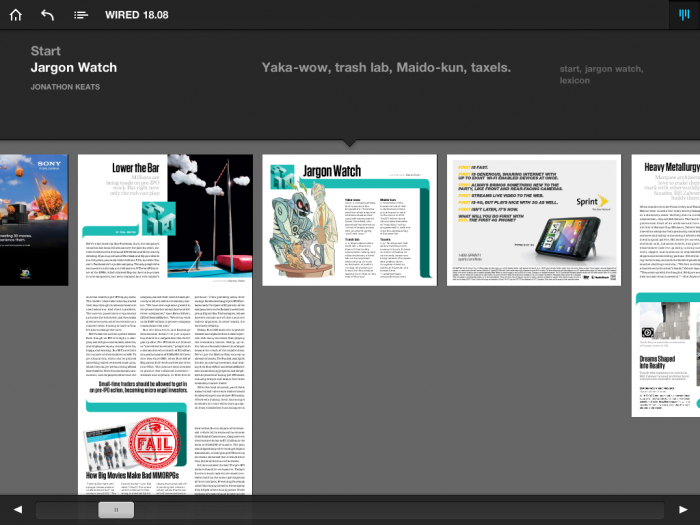
Once in the magazine, the navigation, look and feel, and content are all fine. I haven’t decided whether or not I like the navigation–you go left to right to get stories, and then you flick downwards to read them in their entirety. I personally prefer the way the New York Times app does it, where you have a block of text and a picture which, when you tap on it, takes you to the full story. But it’s a subjective thing, I think. And since you can access the Table of Contents at any time, as well as get a “full” view of the entire magazine, it’s not that big a deal.
“Full” view–you can see the vertical as well as horizontal navigation of the stories
On the flip side, though, you can’t do anything but read. You can’t select and copy text; you can’t look up terms (in a built-in dictionary or externally in Safari or Wikipedia or some such); you can’t modify the font types, sizes, or colors. You can’t do anything at all. As one reviewer on iTunes put it, it’s a lot like a PDF viewer. And frankly, that’s pretty lame. Another fail, in my opinion.
Further, as near as I can tell, there are no links available, either internally to other places in the magazine, or externally to the web. In our inter-linked, Internet-driven world, the magazine of the nerd culture doesn’t let you jump around into that world? Another fail.
So in short, it’s a major disappointment. Here’s the mag of nerds, and it’s basically completely removed from the nerd (i.e. Internet) world and stuck into an app that, frankly, is pretty bad. It’s a bummer. Ironic fail.
The Wired Magazine iPad app is available through iTunes for free; the individual issues (you can’t buy a subscription!) cost $3.99 each.
What I liked: the magazine itself, and how nice it looks on the iPad.
What need improvement: almost everything, honestly–the price, the functionality of the app itself, and the functionality of the magazine issues. Read above for details.


As I mentioned to you before, I haven’t heard anything good about Wired’s app, and certainly at $4 an issue for a locked PDF view, I have no interest at all! Thanks for the great review!
Wow. I have been hoping someone would get the digital magazine thing right. I am personally not thrilled with Zinio – which is slower and clumsier than I’d like – and I don’t like he idea of these app-type magazines. Too messy for me, I guess. I want a media-rich standard magazine format – much as most magazines come in a few standard sizes. So, up until now, most digital periodicals have disappointed me. I do, oddly enough like the digital USA Today for iPad – probably because it includes their crossword puzzle – an interesting implementation – and it pretty much gets me to the stories without interference, but it is isn’t very multimedia-rich either. I also recently tried the MacLife magazine app. It is a reasonably fast performer with rich content, but’s approach is also generally linear – still it is pretty nice since it integrated lots of photographic and video content. I’m still waiting for a standard magazine format and store that actually works semi-naturally with me. Haven’t found it yet, though! Are the mag publishers gonna keep messing this up like the book/eBook publishers did? If they don’t get this sorted out they will keep failing and then call the technology a failure when really it’s their failure to produce an appealing magazine ecosystem. Someday, maybe…
Michael: ironically, I wasn’t planning on reviewing it at all! It’s funny that it works that way sometimes.
Chris: You might check out the NY Times app. I’m not a big fan of the Times, especially since the Iraq war (and their cheerleading), but it’s a pretty good app. I wish they had *all* their daily content available instead of just a small subset, but it’s free, and the navigation is easy and intuitive.