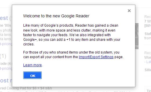
Over the last couple of days, Google has released updates for Google Reader and GMail. Each has a new UI, and has further integration of Google +, as well as the removal of Buzz.
In the case of GMail, it is mostly about a visual overhaul, as noted on the Google Blog here are the main features:
– Streamlined conversations
– Elastic density
– New HD themes
– Smarter navigation
– Better search
In the case of Google Reader the changes are two-fold: the removal of ‘Share’, and a visual overhaul.
To say that the reaction to removing ‘Share’ was swift, loud and negative would be a massive understatement. There have been protests, petitions, even outrage from common Iranians who use it as a social network since all others are banned (including Google +) … yet Google made the changes permanent today.
But more than just swapping Share for G+, the change is much more insidious. According to former Google Reader product manager Brian Shih:
But the new sharing flow around the +1 button has actually made it harder to share. Where you used to be able to click one button, or hit shift-s to one-click share to your audience, you now need to:
Click +1 (no keyboard shortcuts for you)
Click the text box that appears that says “Share to G+”
Then choose your circle you want to share to (or let it default to public)
Then click ShareKeep in mind that on top of requiring 3-4 times as many clicks, you also now must +1 a post publicly to share it, even if it’s shared to a private circle. That bears repeating. The next time you want to share some sexy halloween costumes with your private set of friends, you first must publicly +1 the post, which means it shows up on your profile, plus wherever the hell G+ decides to use +1 data. So much for building a network around privacy controls.
The reason is clear, and core to the very essence of Google – YOU are the product, NOT the customer. Google wants money, and since you are not GIVING them money, clearly SOMEONE is … and these changes are made to keep their CUSTOMERS happy. Which, remember, you are not. You are product. Google + is the future of gathering and selling customer info, ‘Share’ is not – it only helps ‘product’ give things to other ‘product’ without any benefit to potential customers. So ‘Share’ had to go.
As for the visual overhaul, let’s hear again from Brian Shih:
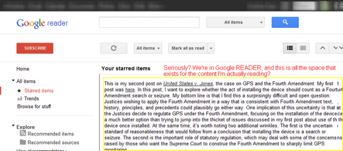
Reader is a product built to consume information, quickly. We designed it to be very good at that one thing. G+ is an experience built around browsing (similar to Facebook) and socializing. Taking the UI paradigm for G+ and mashing it onto Reader without any apparent regard for the underlying function is awful and it shows.
For me, the horrific user interface is the major concern. As the image above shows, Reader is now terribly inefficient with space usage – with no option to customize. As Shih said, “Reader is a product built to consume information, quickly”. That is what I want from it, yet in an attempt to further monetize my interests, Google has messed up my experience in order to subsume it to the pseudo-social network it is stuffing down our throats at every turn.
Last night as the changes went live we had a quick internal chat about Reader. Carly asked “Am I alone in despising the new Google Reader design?” I strongly agreed, then we set about discussing alternatives, coming to the conclusion that there is no real web-based competition, many of us cannot install programs on work computers, and therefore we were discussion iOS alternatives such as Reeder and NewsRack.
In other words, in an attempt to draw us into Google + MORE and further monetize our eyes, Google is in fact driving us – and many others – away.
What are your thoughts on these changes?


For Greader Visually I am split between “I do not like it” and “I absolutely hate it ,why did they do that, what alternative should I switch to” It looks like a giant sheet of paper. I liked seeing the verticle divider lines. They have them for the horizontal and they look fine. I too started looking an alternative web tool. As for Gmail, my theme is intact, so I like it both visually and functionally. I love my android phone, but why must everything be tweeked/dumbed down for kludgy-fat-fingers-designed-to-use-it-on-a-tablet? If I am on a PC, I want buttons and options packed in there. If I want slick simple web sites I will load the mobile version on my phone or PC.
I’m antisocial so the G+ changes don’t bother me but I use a 1024×600 tablet in landscape and, after all the space wasting at the top and the double spacing of actual items I can only see five full titles (out of the several hundred I go through each day). As soon as I find a good Firefox plugin, I’m out of there.
Mike you summed it up perfectly. This update, frankly, sucks. After staring at it again today I was just as disgusted as I was last night.
Plus I have a fear in the back of my head that this g+ integration is only the beginning…and I rely on greader all day every day. If they keep up this integration my work is going to nuke my access….
I RARELY use the desktop version of Reader anymore. I do almost all of Reading in mobile Safari. I love how I can Click to Keep Unread and then hit the Mark All As Read and it will mark them all as read except the ones I have chosen to save for later reading. This way I can cull out all the stuff I don’t want to read when I have just a few minutes and easily find those important articles later. I wish the desktop version acted this way.
I never used the share button, only email article button.
I meant to say I use the desktop version so little, it really hasn’t bothered me too much.
Well Google’s revenue model for nearly everything is about collecting and selling information about you and driving you to their advertisers, from GMail and G+ to Android and Reader so none of this comes as any real surprise to me. Nothing is ever really free and Google is not a philanthropic organization. They are a for-profit company and the money for these things has to come from somewhere. You either buy into this or you don’t. It’s not necessarily a bad thing, but we need to realize that when we use their products, we are subject to the things they need to do to maintain (and/or improve) their profitability. This is just another example of that. I was annoyed last year with their moves to lock down the Translation APIs, meaning many of those third-party translation apps would have to pay to license or disappear. Disappointing, but these things have to be paid for somehow!
While I preferred the older look, this one is fine. I use Google Reader to go through RSS feeds, looking for articles that may interest me (such as this one) and opening them up in tabs for full, native reading. I think I shared maybe three times in all of the many years of using Reader (and those were three more times than I *needed* to share anything), and I’ll never “+1” anything anyway.
It’s fine with me. I understand why others disagree, but I go by the way that I use it.