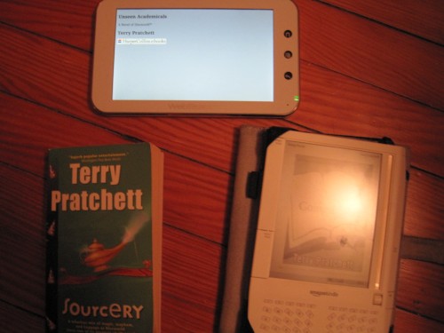
As you may recall, I threw down the gauntlet and vowed to engage paper, e-ink and LCD in a battle to the end. It has been tough, but I’ve forced myself to carve out time to read three books from my favorite author, all in the name of this review. Hopefully you all appreciate the sacrifices I made. 😉
To review, here were the ground rules:
Readability:
• How long can I read comfortably without my eyes needing a break?
• Are the font and margins acceptable for reading?
• Is it formatted correctly and without error?
Navigation:
• Are footnotes and other navigational items easy to locate?
• Is bookmarking easy?
• Can I easily locate and use the table of contents?
Ergonomics:
•Can I comfortably hold the book/device for a long period?
• Are page turns fast and easy?
So all in, there are 8 main scoring areas. There are three “bonus rounds” from some suggestions made by Doug in the original post, but I will cover those after.
A note on scoring: I did my best to keep the scoring centered around the act of reading, but there are some side comments about the ebook readers and programs I used. It’s difficult to separate the two. As far as the layout of the results, I’ll start by listing the category scores and then expand on the reasoning behind them.
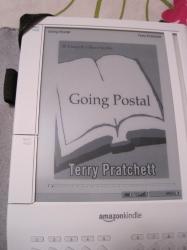
Let’s start with the Kindle book, “Going Postal“.
Readability: 2.5/3. Anyone who has used an e-ink device knows that the screen is designed for readability and comfort. In this area, reading “Going Postal” succeeded without breaking a sweat. Whether I read for 10 minutes or I read for an hour, I had no issues. The book was formatted well, and there were no typographical errors (this can be an issue with any book, but seems to be especially bad with eBooks- in this case there were none.)
I hesitated over giving this 3 or 2.5, and decided to be fair it was going to be a 2.5. The only downside to readability was the same downside as a paper book; when I tried reading while my fiancee was sleeping, I needed a booklight, meaning I had to fiddle and position it constantly to read comfortably. Part of this is a known trade-off of e-ink, part of this was my crappy booklight, but it something to remember when evaluating the book experience on e-ink.
Navigation: 3/3. Footnotes, table of contents, bookmarking…everything went smoothly. Yes, some items end up buried in menus, but nothing is unintuitive, and it’s all fairly quick to access. Footnotes do take you to a separate page, but one click of the back button and you’re right back to the book itself.
Ergonomics: 1.5/2. The Kindle 1 is not the most comfortably built device, with the side buttons in less than perfect places. Page turns were smooth, with the typical eInk refresh rate. I docked it a point in ergonomics because the buttons are a pain, and while this isn’t a Kindle 1 review, it is important to factor in that each ebook reading device has quirks. The K1 may have button issues, another device may just not feel great in the hand, etc.
This leaves the Kindle/eInk with 7/8.
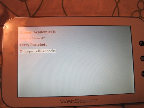
Let’s see how LCD reading stacks up; we’re looking at “Unseen Academicals” read on the Camangi Webstation.
Readability: 2.5/3. The nice thing about using a smartphone or tablet is that you have options as far as background, backlight, etc, and with the right tweaks everything visually looks great on the Camangi. LCD or not, the act of reading is very comfortable. I docked it a bit because while some programs (like Aldiko) give you every customization option possible, other programs are barely more than a blinding white background and a fixed font. Having a number of programs available as eReading platforms can be something of a double-edged sword. Overall, though, having a backlit screen was less straining than I expected, and actually as comfortable as paper or eInk.
Navigation: 2/3. For some reason, the book wasn’t picking up the table of contents at first, so it went from “begin reading” to “about the author”. Without those natural breaks, the book took forever to open and kept giving me blank pages at startup. It’s a pitfall of ebooks in particular that these errors can cause problems; in a paper book a missing table of contents is an inconvenience, but in an eBook it is a huge navigation problem.
Ergonomics: 2/2. Horizontal or vertical, the Camangi is comfortable to read on. Page flips were smooth, and I actually enjoyed being able to flip via touchscreen (or volume keys — that’s on a program by program basis though). The LCD was sharp and clear, and I had no trouble finding a comfortable viewing angle.
Camangi/LCD clocks in at 7/8, tied with the Kindle.
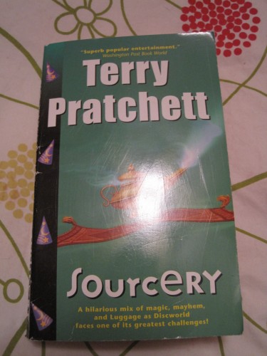
Finally, we have old-fashioned paper. How does a simple paperback stack up? We are using “Sourcery” to find out!
Readability: 2.5/3. Same issue as the Kindle; you need a decent light source to read comfortably. It’s hard to pick on this, since it’s been the case with paper books since the beginning of print media, but if I’m picking on eInk for it, it seems only fair to pick on paper books as well. Fonts and margins were fine, they were in line with what you would expect from a mass market paperback; not as sharp as a quality paperback, but certainly readable.
Navigation: 1.5/3. Flipping through pages and bookmarking physical books obviously works, but it’s a bit more of a pain. Jumping to a specific chapter is also more cumbersome than the digital versions, something that really gets cast into sharp relief when you jump between the formats.
Ergonomics: 1/2. Mass markets are probably the most uncomfortable types of paper books (at least for me.). I am constantly breaking the bindings trying to keep them open to a comfortable reading point. In addition, having to commit to two-handed reading is a tough habit after being used to the one-handedness of the Kindle and Camangi.
Final score for paper: 5/8.
Then we have Doug’s suggested bonus rounds. He asked for:
o) Is there anything unique to one delivery system that the others don’t have, e.g. nice-sized paper maps?
Not in the books I used for testing. In general, ebooks tend to just be digital versions of their paper counterparts, so if the book had nice maps the ebook version is going to have those maps. How readable they are depends heavily on how the book was scanned and digitized.
As far as the delivery of books themselves, obviously paper books are dependent on the bookstore/online ordering experience. With respect to ebooks, the Kindle’s whispernet is absolutely a killer feature on a dedicated ebook reader.
o) How do the three delivery systems stack up with regard to “unusual” formatting issues? For example, David Brin’s “Earth” has a lot of funky formatting in it–how does it look on paper vs. the Kindle vs. an iPhone or such?
Again, this is pretty much depending on how a book is converted for e-consumption. The biggest issue is in the conversion; a good example is how destroyed a PDF can be when it’s converted by Amazon for the Kindle. I’m planning a corollary article about PDF consumption, since that’s a whole other digital mess.
o) How do the “fatigue factors” compare? Lots of people find reading on a small screen tiring, or reading e-ink or an LCD screen eyestrain-causing–how do the platforms stack up? (For Terry Pratchett this isn’t going to matter much, but I’ve been really relieved to read “Anathem” or “Drood” or “Carrion Comfort” on my iPhone rather than lugging around a multi-pound hardback.)
I didn’t experience any eye fatigue, at least not beyond what I always get as I’m falling asleep. However, a big part of this is adjusting the background on the LCD screen to create a nice soft gray background. Pure blinding white backgrounds tend to hurt my eyes really quickly. Eye fatigue is very much a personal issue though. Some people can read on smartphone sized screens without a problem, and I can’t stand reading on less than a 5 inch screen.
Conclusion:
This evaluation is inherently subjective, no matter how hard I tried to maintain some neutrality. The Kindle wins by a wider margin against the paper, but more narrow against LCD/Camangi. I tried to be even-handed in where I docked points, though it was tough sometimes trying to draw a line between the device itself versus the overall ebook/book experience. I also noticed through the course of my testing that I have developed a distinct bias against paper books over the last 6-12 months.
It’s odd, because I spent so long working for Borders. As much as I liked ebooks, paper books were special. Books were a passion, they were why I risked paper cuts and falling bookshelves, why I spent my days selling them and my nights reading them. But somewhere along the way ebooks went from an occasional habit to my preferred format. This smackdown seemed to quantify that in a way I hadn’t thought of before (though the stack of unread paper books on my desk suggests maybe deep down I knew that!)
The important thing was that all three formats/platforms got the main job done. I enjoyed reading immensely on all three, and didn’t feel like there were any dealbreakers that took me out of the books themselves. In the end, it’s all about what’s comfortable for you, and what helps you enjoy a great book!
How would this same smackdown stack up for you? Share your thoughts below!
