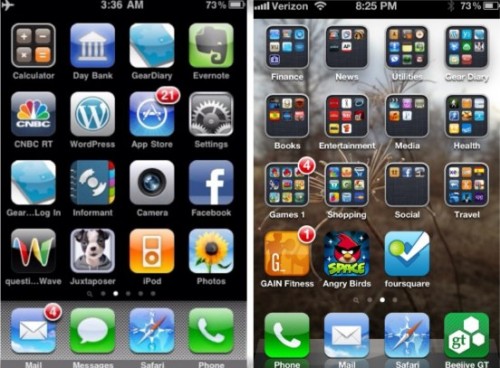
I posed a question to my fellow staff at Gear Diary, asking all iPhone users why Apple hasn’t really changed their UI since 2007. As a non iPhone user, my questions stemmed from a post that Carly had put up about her finding her original iPhone, when she posted a side by side of the home screens.
Original iPhone (left) iPhone 4S (right)
As an Android user, I enjoy changing up my home screen or theme on a weekly basis. That might seem a little excessive to some, but with so many cool launcher options, icons, and tweaks, I feel like it keeps my experience fresh. If it’s ever needed, I can simply change back to the original or something else with a few simple clicks.
The responses from the team were pretty unanimous that most appreciate the changes that have been made since the original 2007 iPhone, even if they were not huge or dramatic. Like everything else these days, everyone has a different opinion and likes things a certain way of doing things, which is fine by me on all accounts. As an enthusiast I stumbled across some amazing looking home screens while trolling forums and various Android sites. I keep my stuff pretty basic and clean, usually with some side screens filled with toggles and a few non intrusive widgets.
It’s pretty obvious that no one is really happy with the Android updates conundrum, and the world is still waiting to hear from Google on what they are going to do about it. I think Google keeps the launchers pretty simple and clean, leaving the fancy stuff up to third-party developers and custom carrier and manufacturer UI enhancements.
Although I don’t really like the UI skins like HTC Sense, Samsung Touchwiz, or Motorola Blur, I do like some of the things that they do to allow easy access and convenience. I like to think of my home screen as a dashboard, similar to what you’d find in a car, I like to see a small snippet of everything that is happening with my phone without the need to drill deep down into the menus or open specific apps to do so. I am not saying by any means that my way is better than another, just that the options are there in Android for anyone (rooted or not) to personalize their home screen to their personal taste.
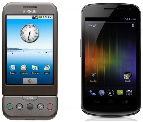
Original Android 1.5 (left) Android 4.x (right)
Images courtesy of HTC and Samsung
As the replies to my question came in on our Yammer discussion, it was evident that the thoughts were that Android’s UI changes became more of a flaw than function, and that the OS is suffering because of it. I will be the first one to agree that most UI changes implemented by carriers are not the kindest on speed and function; they often introduce lag, battery use issues, and an overall bloated experience. Thankfully that can easily be changed with a simple download of a new launcher.
I agree that iOS has a great UI as a whole, but what draws me away the most is that there is some basic function missing from an otherwise plain home screen. People ask me all the time why I don’t prefer to use an iPhone over Android. Even with all the issues that have surfaced over the years with Android, my favorite function is the ability to set my up my launcher and home screen up exactly how I want it.
Here are the some of the things holding me back from being an iPhone user myself. (This is primarily based on the home screen, launcher, and not really the UI as a whole)
- Toggles. Considering the screen to already be unlocked, I have the ability to turn on or off things like WiFi, GPS, Data, BT, Sound, Rotation and a Flashlight. The minimum clicks on iOS is 2 if you are already on the device you want to turn on in setting plus another click to go to the home menu.
- Widgets and live apps. Some may be a hindrance in Android and suck up precious battery. But with anything else that can easily be removed or changed if a user decides to do so. Some of the most popular widgets on Android usually tend to be weather, clocks, Facebook, News, Twitter, Music, and calendar. With iOS you have some that show up in the notification bar but still have to open an app to browse your appointments, peak at your daily agenda, or read through your social media feeds. There are plenty of resource and battery safe widgets in Android that are small or large, and pretty unobtrusive if you want them to be.
- Sizing and placement. Most Android UI’s let you re-size widgets, icons, and generally whatever else you want. You can also change the grid size to add more or less rows and columns to better fit things on one screen or another. It also bothers me that you cannot have open space between apps or icons on iOS. Not sure why anyone would really want to other than to open up some space to show off parts to a cool wallpaper or background, but would be nice.
For ‘normal people’ having an interface that changes around is a cause of stress and frustration, NOT a ‘breath of fresh air’. Most people want something to get out of the way and let them get stuff done. – Michael Anderson
[My wife] could care less about what goes on under the hood or want so much customizability or granular control, perhaps in the same way most people view cars. Sure you can go all Fast and Furious with your car, but the vast bulk of people just want to hop in the car, turn the key, and be off (but with a decent or functional sound system). – Bryan EleyiOS is not the Ferrari. It is the Toyota. That said, it can do a LOT more than many non-iOS fans give it credit for. I think the key is that the interface changes and advanced features are not in the way of normal use. They are off to the side, as it were. That said, I think there ARE things that need to change and hopefully will change. Not because iOS is bad, or boring, or is failing, but because things have moved on and iOS needs to address some of those things. – Chris GavulaYou know the kind of person I am. I’m a tweaker….and I do NOT want iOS to get a wholesale change. I have to support my wife’s phone, and generally I DON’T have to thanks to the consistent UI. If I had to suggest any change, I would suggest a back button. Going back to home all the time kinda sucks, but it’s not as bad as some of the Android foibles. – Joel McLaughlin
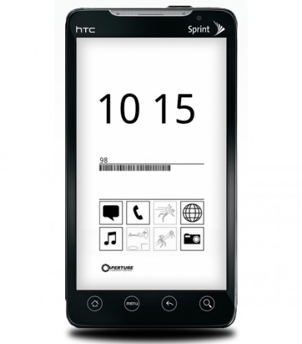
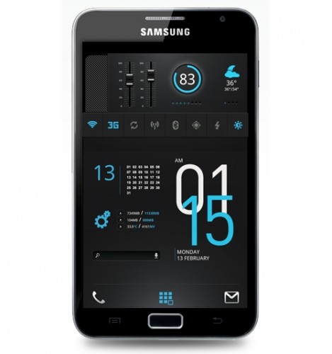
I snagged a few home screens from various sites that I found to be pretty cool. Obviously they might not be everyone’s cup of tea, but you can get an idea of some of the cool things that can be done with customizable UI, widgets, and themes. These are of course not what the typical user sees once their screen is unlocked, but with a little work and a few apps having a setup like this is not terribly difficult to accomplish.
Pretty cool, or simply much too busy?
These are a few more popular user made screens found on mycolorscreen.com
For Science
Note Worthy
Marvel vs. Capcom
As you can see, Android allows you to do pretty much do whatever you want. Most normal users such as myself don’t have the artistic ability to such crazy creations, but with the amount of free and paid launchers out there and a vast community it’s really not that hard to make something pretty unique for yourself.
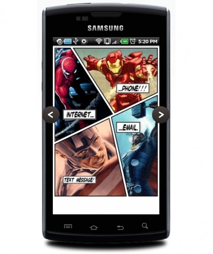
Launchers give you the ability to easily change the way the look and feel of the home screen works and can potentially maximize the amount of time spent on your device. Though some changes may not work as well with certain phones depending on how resource intensive “live” apps and widgets work most are simply backgrounds or pictures mounted as normal icons but rearranged and resized however you want them (such as the Marvel home screen above).
You can always download a launcher and try it out, if it doesn’t fit your needs then simply uninstall it and you are back where you started. Some companies are cashing in on this technology like SPB. They have a $15 home screen/launcher replacement that pushes mobile UI’s to the limits. This launcher is a little extreme but probably one of the coolest launcher’s I’ve seen yet for the Android platform.
Official SPB Shell 3D Video ( the video is a little boring but you get the idea)
So after seeing all that is available on the Android system, and seeing some thoughts from myself and my fellow writers, my question still stands.
Does iOS need a UI/Launcher overhaul? Could it use a few widgets? Or is it better left as is, with the idea that it works fine and will continue to improve?
As you know our diversity on Gear Diary is one of our strong points; the iPhone is still probably leading as the #1 used phone on the site, and our thoughts on the matter are pretty much unanimous that iOS could welcome a few things here or there (what OS couldn’t?), but overall everyone is pretty much happy with the way things are.
Android has numerous options, Windows Phone has live tiles and some small theming capabilities, but in my opinion iOS is very similar looking across the their timeline.
Let us know your thoughts; feel free to leave a comment.

In a word, YES! But this is about much more than just a launcher. Apple is mired in the app-centric view of the mobile world and in the world of icons as the launcher mechanism as well. Want to take photo? Open the camera app. Want to edit it? Open a photo editing app. Send it to Facebook? Open the Facebook app. They mean it when they claim, “There’s an app for that!” I firmly believe that Steve Jobs considered this to be the epitome of mobile user interface design and had no notions of changing that.
Unfortunately (for Apple), others like Microsoft have come along and advanced the notion of how mobile devices can work, deprecating the apps in favor of a more integrated design. Google, did some of it first with their useful widgets that can do much more than a static icon. But those widgets can be deadly to battery life, so Microsoft has improved things with their live tiles and OS-managed background task service.
I’m reminded in some ways of the Windows-vs-Mac competition, where Macs have similarly been mired in old-fashioned UI conventions of windows with menus at the top (of the screen)and a single mouse button (for the most part) to select things from those menus. Obviously, Windows, and Linux too, have come a long way from that world with ribbons and right-clicks and other UI conventions that Jobs never liked and only grudgingly allowed in Mac OS.
I would say that allowing third-party widgets, either on home screens (preferred) or in the notification bar, would be a great first step. I realize that badly-designed ones can burn a little more battery, but I think that would be the most useful update. Perhaps also the ability to hide apps from the launcher (though still make them available from search) wouldn’t be a bad idea. For now I hide those apps in folders on my Touch, but I’d love to just get them off the home screens altogether without uninstalling.
I agree with everything you’ve presented here. iOS is feeling very long in the tooth.