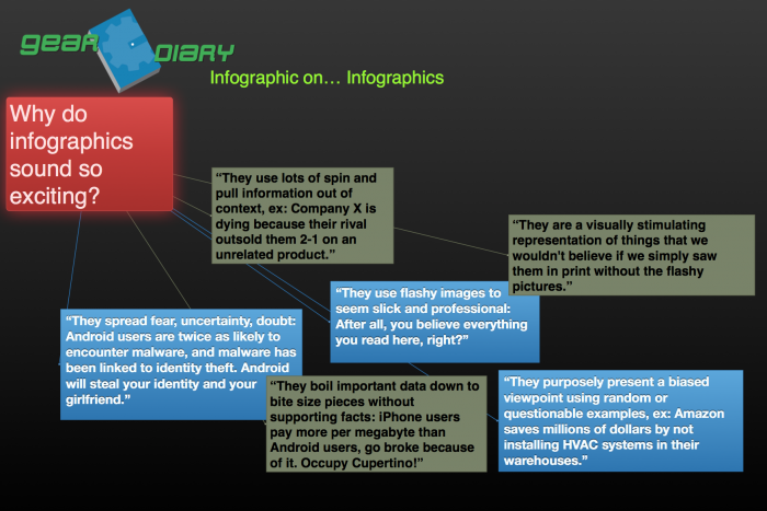
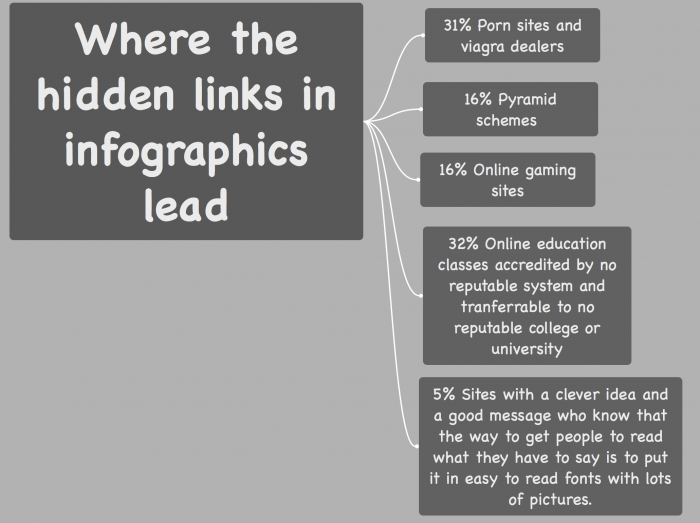
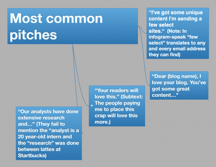
Spend enough time on the Internet, and you’ll find an infographic. These are “educational” graphics that distill bits of information into pretty pictures and at-a-glance factoids. As a concept, they aren’t terrible, but only if they’re used as a summary for a full report. Unfortunately, lately they’ve become flashy vehicles for marketers with an agenda.
Here at Gear Diary, we want to make sure we properly educate our readers to understand infographics, and the best way to do this is clearly to fight fire with fire, so we’ve helpfully put together this “Anatomy of an Infographic”! What triggered us to share this today, you ask? Well, we received an Infographic this morning regarding a certain technology company and their apparent fall from grace … all supported by random statistics culled together to look like a trend. Needless to say, we are choosing to run our guide to infographics in its place!


